Category Plots
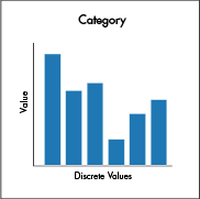
Category plots display data values from different discrete categories. By default, values are presented as vertical bars. However, by using plotting styles, the data can be represented as a bar, a stacked bar, a line, an area or a stacked area.
Data Sourcing
Category plots can be created using data from tables, arrays and functions.
Creating a Category Plot using Data from a Table
When data is sourced from a table, the following syntax can be used to create a category:
catPlot("SeriesName", source, "CategoryCol", "ValueCol")
catPlotis the method used to create a category plot."SeriesName"is the name (string) you want to use to identify the series on the plot itself.sourceis the table that holds the data you want to plot."CategoryCol"is the name of the column (as a string) to be used for the categories."ValueCol"is the name of the column (as a string) to be used for the values.
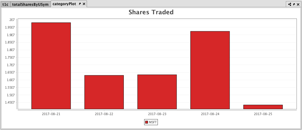
Example: Plotting a Category Plot Using Data from a Table
from deephaven import Plot
# source the data
t1c = db.t("LearnDeephaven", "StockTrades") \
    .where("Date > `2017-08-20`", "USym = `MSFT`") \
    .view("Date", "USym", "Last", "Size", "ExchangeTimestamp")

totalSharesByUSym = t1c.view("Date", "USym", "SharesTraded=Size") \
    .sumBy("Date", "USym")

# build the plot
categoryPlot = Plot.catPlot("MSFT", totalSharesByUSym.where("USym = `MSFT`"), "Date", "SharesTraded") \
    .chartTitle("Shares Traded") \
    .show()
//source the data
t1c = db.t("LearnDeephaven", "StockTrades")
        .where("Date > `2017-08-20`", "USym = `MSFT`")
        .view("Date", "USym", "Last", "Size", "ExchangeTimestamp")

totalSharesByUSym = t1c.view("Date", "USym", "SharesTraded=Size")
        .sumBy("Date", "USym")

//build the plot
categoryPlot = catPlot("MSFT", totalSharesByUSym.where("USym = `MSFT`"), "Date", "SharesTraded")
        .chartTitle("Shares Traded")
        .show()
Creating a Category Plot using Data from Arrays
When data is sourced from a array, the following syntax can be used to create a category:
catPlot("SeriesName", [category], [values])
catPlotis the method used to create a category plot."SeriesName"is the name (as a string) you want to use to identify the series on the chart itself.[category]is the array containing the data to be used for the X values.[values]is the array containing the data to be used for the Y values.
Category Plotting Options
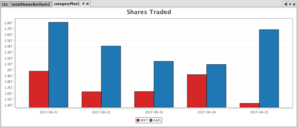
Plotting Multiple Categories with Shared Axes
You can also compare multiple categories over the same period of time by creating a category plot with shared axes. In the following example, a second category plot has been added to the previous example, thereby creating bar graphs on the same chart. The query to create this plot follows:
from deephaven import Plot

t2c = db.t("LearnDeephaven", "StockTrades") \
    .where("Date > `2017-08-20`", "USym in `AAPL`, `MSFT`") \
    .view("Date", "USym", "Last", "Size", "ExchangeTimestamp")

totalSharesByUSym2 = t2c.view("Date", "USym", "SharesTraded=Size").sumBy("Date", "USym")

categoryPlot2 = Plot.catPlot("MSFT", totalSharesByUSym2.where("USym = `MSFT`"), "Date", "SharesTraded") \
    .catPlot("AAPL", totalSharesByUSym2.where("USym = `AAPL`"), "Date", "SharesTraded") \
    .chartTitle("Shares Traded") \
    .show()
t2c = db.t("LearnDeephaven", "StockTrades")
        .where("Date > `2017-08-20`", "USym in `AAPL`, `MSFT`")
        .view("Date", "USym", "Last", "Size", "ExchangeTimestamp")

totalSharesByUSym2 = t2c.view("Date", "USym", "SharesTraded=Size").sumBy("Date", "USym")

categoryPlot2 = catPlot("MSFT", totalSharesByUSym2.where("USym = `MSFT`"), "Date", "SharesTraded")
        .catPlot("AAPL", totalSharesByUSym2.where("USym = `AAPL`"), "Date", "SharesTraded")
        .chartTitle("Shares Traded")
        .show()
Subsequent categories can be added to the chart by adding additional catPlot() methods to the query. However, the plotBy() method can also be used to do this. See plotBy().
Additional Formatting Options
Using Plotting Styles with Category Plots
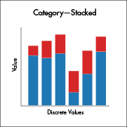
Category plots in Deephaven default to a bar chart. However, Deephaven's plotStyle() method can be used to format Category plots as line charts, stacked bar charts, area charts, stacked area charts, scatter charts and step charts. See Plot Styles.
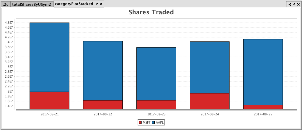
To demonstrate, the following query will generate a category plot with a "stacked area" plot style.
Plotting Multiple Category Plots with Stacked Bar Plot Style
from deephaven import Plot

t2c = db.t("LearnDeephaven", "StockTrades") \
    .where("Date >`2017-08-20`", "USym in `AAPL`, `MSFT`") \
    .view("Date", "USym", "Last", "Size", "ExchangeTimestamp")

totalSharesByUSym2 = t2c.view("Date", "USym", "SharesTraded=Size").sumBy("Date", "USym")

categoryPlotStacked = Plot.catPlot("MSFT", totalSharesByUSym2.where("USym = `MSFT`"), "Date", "SharesTraded") \
    .catPlot("AAPL", totalSharesByUSym2.where("USym = `AAPL`"), "Date", "SharesTraded") \
    .plotStyle("stacked_bar") \
    .chartTitle("Shares Traded") \
    .show()
t2c = db.t("LearnDeephaven", "StockTrades")
        .where("Date >`2017-08-20`", "USym in `AAPL`, `MSFT`")
        .view("Date", "USym", "Last", "Size", "ExchangeTimestamp")

totalSharesByUSym2 = t2c.view("Date", "USym", "SharesTraded=Size").sumBy("Date", "USym")

categoryPlotStacked = catPlot("MSFT", totalSharesByUSym2.where("USym = `MSFT`"), "Date", "SharesTraded")
        .catPlot("AAPL", totalSharesByUSym2.where("USym = `AAPL`"), "Date", "SharesTraded")
        .plotStyle("stacked_bar")
        .chartTitle("Shares Traded")
        .show()
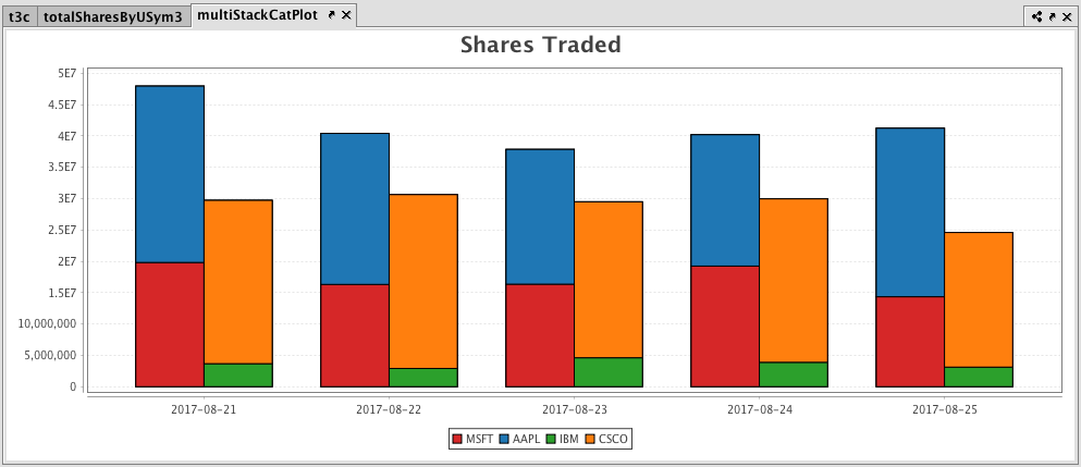
Plotting Multiple Sets of Stacked Category Plots
Multiple sets of stacked category plots can be created by assigning each category to a group and then applying a plot style. The following query demonstrates how to create two sets of stacked bars per category:
from deephaven import Plot

t3c = db.t("LearnDeephaven", "StockTrades") \
    .where("Date > `2017-08-20`", "USym in `AAPL`, `MSFT`, `IBM`, `CSCO`") \
    .view("Date", "USym", "Last", "Size", "ExchangeTimestamp")

totalSharesByUSym3 = t3c.view("Date", "USym", "SharesTraded=Size").sumBy("Date", "USym")

multiStackCatPlot = Plot.catPlot("MSFT", totalSharesByUSym3.where("USym = `MSFT`"), "Date", "SharesTraded") \
    .group(1) \
    .catPlot("AAPL", totalSharesByUSym3.where("USym = `AAPL`"), "Date", "SharesTraded") \
    .group(1)\
    .catPlot("IBM", totalSharesByUSym3.where("USym = `IBM`"), "Date", "SharesTraded") \
    .group(2) \
    .catPlot("CSCO", totalSharesByUSym3.where("USym = `CSCO`"), "Date", "SharesTraded") \
    .group(2)\
    .plotStyle("stacked_bar") \
    .chartTitle("Shares Traded") \
    .show()
t3c = db.t("LearnDeephaven", "StockTrades")
        .where("Date > `2017-08-20`", "USym in `AAPL`, `MSFT`, `IBM`, `CSCO`")
        .view("Date", "USym", "Last", "Size", "ExchangeTimestamp")

totalSharesByUSym3 = t3c.view("Date", "USym", "SharesTraded=Size").sumBy("Date", "USym")

multiStackCatPlot = catPlot("MSFT", totalSharesByUSym3.where("USym = `MSFT`"), "Date", "SharesTraded")
        .group(1)
        .catPlot("AAPL", totalSharesByUSym3.where("USym = `AAPL`"), "Date", "SharesTraded")
        .group(1)
//the two series above are assigned to group 1

        .catPlot("IBM", totalSharesByUSym3.where("USym = `IBM`"), "Date", "SharesTraded")
        .group(2)
        .catPlot("CSCO", totalSharesByUSym3.where("USym = `CSCO`"), "Date", "SharesTraded")
        .group(2)
//the two series above are assigned to group 2

        .plotStyle("stacked_bar")
        .chartTitle("Shares Traded")
        .show()
Category Plotting with Error Bars
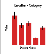 Category plots can also be created with error bars. However, this is accomplished using a different plotting method. Details about plotting with error bars can be found at Plotting with Error Bars.
Additional Options for Category Plotting
For additional formatting options for Category plotting, see:
Last Updated: 16 February 2021 18:07 -04:00 UTC Deephaven v.1.20200928 (See other versions)
Deephaven Documentation Copyright 2016-2020 Deephaven Data Labs, LLC All Rights Reserved