Plotting Multiple Series in Chart
There are two ways to plot multiple series in a chart.
- Using multiple individual plotting methods chained together
- Using the
plotBygroup of methods
Multiple plot methods can be used within the same query to produce a chart with multiple series. An example follows:
from deephaven import Plot

t1 = db.t("LearnDeephaven", "StockTrades")\
    .where("Date=`2017-08-25`")

multiplePlot = Plot.plot("PFE", t1.where("USym = `PFE`"), "Timestamp", "Last")\
   .plot("CSCO", t1.where("USym = `CSCO`"), "Timestamp", "Last")\
   .plot("INTC", t1.where("USym = `INTC`"), "Timestamp", "Last")\
   .plot("BAC", t1.where("USym = `BAC`"), "Timestamp", "Last")\
   .show()
t1 = db.t("LearnDeephaven","StockTrades")
    .where("Date=`2017-08-25`")

multiplePlot = plot("PFE", t1.where("USym = `PFE`"), "Timestamp", "Last")
   .plot("CSCO", t1.where("USym = `CSCO`"), "Timestamp", "Last")
   .plot("INTC", t1.where("USym = `INTC`"), "Timestamp", "Last")
   .plot("BAC", t1.where("USym = `BAC`"), "Timestamp", "Last")
   .show()
In this example, four individual plot methods are required to generate the plot.
The plotBy group of methods follows the same general syntax as their respective plotting methods. However, the plotBy methods include an additional argument that enables users to specify the grouping column to be used to plot multiple series. This greatly simplifies and shortens the query structure.
For example, the following query uses the plotBy() method to create the same chart as the previous query, but with far greater efficiency:
from deephaven import Plot

t1 = db.t("LearnDeephaven", "StockTrades")\
    .where("Date=`2017-08-25`")

t6 = t1.where("USym in `PFE`,`CSCO`,`INTC`,`BAC`")

plotBySample = Plot.plotBy("Aug25", t6, "Timestamp", "Last", "USym")\
    .xBusinessTime()\
    .show()
t1 = db.t("LearnDeephaven","StockTrades")
    .where("Date=`2017-08-25`")

t6=t1.where("USym in `PFE`,`CSCO`,`INTC`,`BAC`")

plotBySample = plotBy("Aug25", t6, "Timestamp", "Last", "USym")
    .xBusinessTime()
    .show()
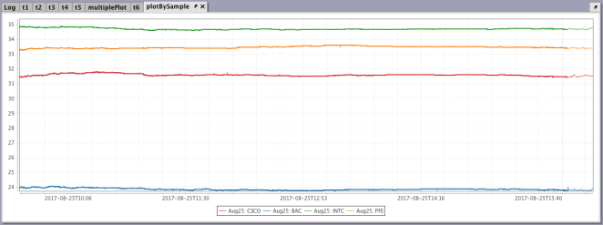
Only one table (t6) is generated by filtering the source table to contain information about all four USyms. Then, the plotBy method uses USym (the last argument) as the grouping column, which enables the plot to show data for the four USyms in the table, as shown below.
There are three versions of the plotBy methods. The plotBy, catPlotBy and ohlcPlotBy methods follow the same general syntax as the plot, catPlot and ohlcPlot methods, respectively. However, the additional argument enables users to specify the grouping column to be used to plot multiple series. The syntax for each method follows:
plotBy
plotBy("Series1", source, "xCol", "yCol", "groupByCol")
catPlotBy
catPlotBy("SeriesName", source, "CategoryCol", "ValueCol", "groupByCol")
ohlcPlotBy
ohlcPlotBy("SeriesName", source, "Time", "Open", "High", "Low", "Close" "groupByCol")
Using Plot Styles when Plotting Multiple Series in a Chart
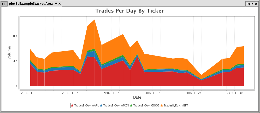
The plotStyle() methods provide users with a convenient way to change the default output for certain plotting methods. For example, an XY series plot defaults to a line chart. However, you can easily the line chart to a stacked area chart by inserting .plotStyle("stacked_area") into the query that is creating the plot, as shown below.
from deephaven import Plot

t_pb = db.t("LearnDeephaven", "EODTrades").where("ImportDate = `2017-11-01`", "Ticker in `GOOG`,`AMZN`,`AAPL`, `MSFT`")\
    .update("DateString = EODTimestamp.toDateString(TZ_NY)")\
    .where("inRange(DateString, `2016-11-01`, `2016-12-01`)")

plotByExampleStackedArea = Plot.plotBy("TradesByDay", t_pb, "EODTimestamp", "Volume", "Ticker")\
    .chartTitle("Trades Per Day By Ticker")\
    .xLabel("Date")\
    .yLabel("Volume")\
    .plotStyle("stacked_area")\
    .show()
t_pb = db.t("LearnDeephaven", "EODTrades")
    .where("ImportDate = `2017-11-01`", "Ticker in `GOOG`,`AMZN`,`AAPL`, `MSFT`")
    .update("DateString = EODTimestamp.toDateString(TZ_NY)")
    .where("inRange(DateString, `2016-11-01`, `2016-12-01`)")

plotByExampleStackedArea = plotBy("TradesByDay", t_pb, "EODTimestamp", "Volume", "Ticker")
    .chartTitle("Trades Per Day By Ticker")
    .xLabel("Date")
    .yLabel("Volume")
    .plotStyle("stacked_area")
    .show()
For additional formatting options, please refer to:
Last Updated: 16 February 2021 18:07 -04:00 UTC Deephaven v.1.20200928 (See other versions)
Deephaven Documentation Copyright 2016-2020 Deephaven Data Labs, LLC All Rights Reserved