ErrorBar Plots
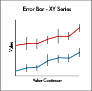
Error bar plotting is available for XY series plots and category plots. Error bar plots, which visually indicate the uncertainties in a dataset, are useful in determining whether the variability in your data is statistically significant. For instance, if your plot shows average values, a short error bar shows that the average value is more certain because the values are concentrated, while a long error bar shows a greater amount of uncertainty because the values are spread out, and thus less reliable. The error bars typically represent standard deviation or a particular confidence interval.
XY Series Plots with Error Bars
There are three methods available to plot an XY series plots with error bars:
errorBarX()is used to create an XY series plot with error bars drawn in the same direction as the X axis (horizontally).errorBarY()is used to create an XY series plot with error bars drawn in the same direction as the Y axis (vertically).errorBarXY()is used to create an XY series plot with error bars drawn both horizontal and vertically.
Data Sourcing
XY Series Plots with Error Bars can be created from data sourced from a table or an array. Please refer to each of the following options for further details and syntax.
errorBarX()
When creating an errorBarX plot using data sourced from a table, the following syntax can be used:
errorBarX("SeriesName", source, "x", "y", "xLow", "xHigh")
errorBarXis the method used to create an errorBarX plot.- "
SeriesName" is the name (as a string) you want to use to identify the series on the plot itself. sourceis the table that holds the data to be used for the plot.- "
x" is the name of the column of data to be used for the X value. - "
y" is the name of the column of data to be used for the Y value. - "
xLow" is the name of the column of data to be used for the low error value on the X axis. - "
xHigh" is the name of the column of data to be used for the high error value on the X axis.
When creating an errorBarX plot using data sourced from an array, the following syntax can be used:
errorBarX("SeriesName", [x], [y], [xLow], [xHigh])
errorBarXis the method used to create an errorBarX chart.- "
SeriesName" is the name (as a string) you want to use to identify the series on the chart itself. - "
[x]" is the array containing the data to be used for the X value. - "
[y]" is the array containing the data to be used for the Y value. - "
[xLow]" is the array containing the data to be used for the low error value on the X axis. - "
[xHigh]" is the array containing the data to be used for the high error value on the X axis.
errorBarY()
When creating an errorBarY plot using data sourced from a table, the following syntax can be used:
errorBarY("SeriesName", source, "x", "y", "yLow", "yHigh")
errorBarYis the method used to create an errorBarY plot.- "
SeriesName" is the name (as a string) you want to use to identify the series on the plot itself. sourceis the table that holds the data to be used for the plot.- "
x" is the name of the column of data to be used for the X value. - "
y" is the name of the column of data to be used for the Y value. - "
yLow" is the name of the column of data to be used for the low error value on the Y axis. - "
yHigh" is the name of the column of data to be used for the high error value on the Y axis.
When creating an errorBarY plot using data sourced from an array, the following syntax can be used:
errorBarY("SeriesName", [x], [y], [yLow], [yHigh])
errorBarYis the method used to create an errorBarY plot.- "
SeriesName" is the name (as a string) you want to use to identify the series on the chart itself. - "
[x]" is the array containing the data to be used for the X value. - "
[y]" is the array containing the data to be used for the Y value. - "
[yLow]" is the array containing the data to be used for the low error value on the Y axis. - "
[yHigh]" is the array containing the data to be used for the high error value on the Y axis.
errorBarXY()
When creating an errorBarXY plot using data sourced from a table, the following syntax can be used:
errorBarXY("SeriesName", source, "x", "xLow", "xHigh", "y", "yLow", "yHigh")
errorBarXYis the method used to create an errorBarXY plot.- "
SeriesName" is the name (as a string) you want to use to identify the series on the plot itself. sourceis the table that holds the data to be used for the plot.- "
x" is the name of the column of data to be used for the X value. - "
xLow" is the name of the column of data to be used for the low error value on the X axis. - "
xHigh" is the name of the column of data to be used for the high error value on the X axis. - "
y" is the name of the column of data to be used for the Y value. - "
yLow" is the name of the column of data to be used for the low error value on the Y axis. - "
yHigh" is the name of the column of data to be used for the high error value on the Y axis.
When creating an errorBarX Plot using data sourced from an array, the following syntax can be used:
errorBarXY("SeriesName", "[x]", [xLow], [xHigh], "[y]", [yLow], [yHigh])
errorBarXis the method used to create an errorBarX chart.- "
SeriesName" is the name (as a string) you want to use to identify the series on the chart itself. - "
[x]" is the array containing the data to be used for the X value. - "
[xLow]" is the array containing the data to be used for low error value on the X axis. - "
[xHigh]" is the array containing the data to be used for high error value on the X axis. - "
[y]" is the array containing the data to be used for the Y value. - "
[yLow]" is the array containing the data to be used for low error value on the Y axis. - "
[yHigh]" is the array containing the data to be used for high error value on the Y axis
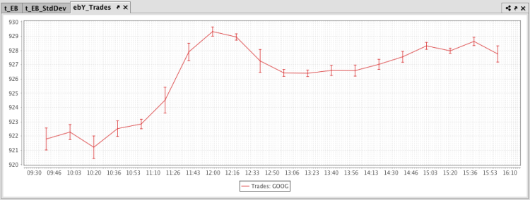
Example - errorBarY
The query shown in the example below will plot the standard deviation in the value of Google trades every 20 minutes. The resulting plot will be plotted as a line graph with error bars running vertically.
from deephaven import Plot

# source the data
t_EB = db.t("LearnDeephaven", "StockTrades")\
    .where("Date = `2017-08-23`", "USym = `GOOG`")\
    .updateView("TimeBin=upperBin(Timestamp, 20 * MINUTE)")\
    .where("isBusinessTime(TimeBin)")

# calculate standard deviations for the upper and lower error values
t_EB_StdDev = t_EB.by(caf.AggCombo(caf.AggAvg("AvgPrice = Last"), caf.AggStd("StdPrice = Last")), "TimeBin")

# plot the data
ebY_Trades = Plot.errorBarY("Trades: GOOG", t_EB_StdDev.update("AvgPriceLow = AvgPrice - StdPrice",
"AvgPriceHigh = AvgPrice + StdPrice"), "TimeBin", "AvgPrice", "AvgPriceLow", "AvgPriceHigh")\
    .show()
//source the data
t_EB = db.t("LearnDeephaven", "StockTrades")
    .where("Date = `2017-08-23`", "USym = `GOOG`")
    .updateView("TimeBin=upperBin(Timestamp, 20 * MINUTE)")
    .where("isBusinessTime(TimeBin)")

//calculate standard deviations for the upper and lower error values
t_EB_StdDev = t_EB.by(AggCombo(AggAvg("AvgPrice = Last"), AggStd("StdPrice = Last")), "TimeBin")

//plot the data
ebY_Trades = errorBarY("Trades: GOOG", t_EB_StdDev.update("AvgPriceLow = AvgPrice - StdPrice", "AvgPriceHigh = AvgPrice + StdPrice"), "TimeBin", "AvgPrice", "AvgPriceLow", "AvgPriceHigh")
    .show()
The first code block gathers the data for the plot, telling Deephaven to access the StockTrades table in the LearnDeephaven namespace, and then filter it to include only the data for August 23, 2017, and only when the USym is GOOG. The data is downsampled (binned) for 20-minute intervals, and is then filtered again to include only the data that occurs within business hours. That data is then saved to a new variable named trades.
The second block of code calculates the average of the values in the Last column and the standard deviation of the values in the Last column. The results will appear in new columns, AvgPrice and StdPrice respectively, in the new table called tradesStats.
The third code block tells Deephaven:
- To create an errorBarY plot named
ebY_Trades. - "Trades: GOOG" is the series name.
- The data needed for plotting is sourced from the
t_EB_StdDevtable. Then, two columns in that table are created in the table using the update method:AvgPriceLowis calculated by subtracting the standard deviation of the price from the average.AvgPriceHighis calculated by adding the average price to the standard deviation.
- Data from the
TimeBincolumn is to be used for the X value. - Data from the
AvgPricecolumn is to be used as the Y value. - Data from the
AvgPriceLowcolumn is to be used for the low error value on the Y axis. - Data from the
AvgPriceHighcolumn is to be used for the high error value on the Y axis. - The
.showmethod then tells Deephaven to present the plot in the Deephaven console.
The resulting plot is presented below.
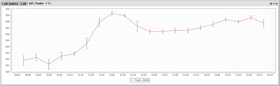
Customize Error Bar Color
Users can choose a specific color for Error Bars using the errorBarColor method. In the previous examples, both the error bars and dataset are red. The following query produces green error bars:
from deephaven import Plot

# plot the data
ebY_Trades = Plot.errorBarY("Trades: GOOG", t_EB_StdDev.update("AvgPriceLow = AvgPrice - StdPrice",
"AvgPriceHigh = AvgPrice + StdPrice"), "TimeBin", "AvgPrice", "AvgPriceLow", "AvgPriceHigh").errorBarColor("green").show()
//source the data
t_EB = db.t("LearnDeephaven", "StockTrades")
	.where("Date = `2017-08-23`", "USym = `GOOG`")
	.updateView("TimeBin=upperBin(Timestamp, 20 * MINUTE)")
	.where("isBusinessTime(TimeBin)")

//calculate standard deviations for the upper and lower error values
t_EB_StdDev = t_EB.by(AggCombo(AggAvg("AvgPrice = Last"), AggStd("StdPrice = Last")), "TimeBin")

//plot the data
ebY_Trades = errorBarY("Trades: GOOG", t_EB_StdDev.update("AvgPriceLow = AvgPrice - StdPrice", "AvgPriceHigh = AvgPrice + StdPrice"), "TimeBin", "AvgPrice", "AvgPriceLow", "AvgPriceHigh")
	.errorBarColor("green")
	.show()
The resulting plot is shown below:
See also Assigning Colors in Deephaven.
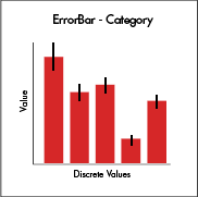
Category Plots with Error Bars
catErrorBar() is the method used to create a Category Plot with Error Bars. This creates a Category Plot with the discrete values on the X axis, numerical values on the Y axis. Error bars can only run vertically when using catErrorBar().
Data Sourcing
Category plot with error bars can be created from data sourced from a table or an array.
When data is sourced from a table, the following syntax can be used:
catErrorBar("SeriesName", source, "x", "y", "yLow", "yHigh")
catErrorBarXthe method used to create a category plot with vertical errorBars.- "
SeriesName" is the name (as a string) you want to use to identify the series on the plot itself. sourceis the table that holds the data you want to plot.- "
x" is the name of the column of data to be used for the X value. - "
y" is the name of the column of data to be used for the Y value. - "
yLow" is the name of the column of data to be used for the low error value. - "
yHigh" is the name of the column of data to be used for the high error value.
When data is sourced from an array, the following syntax can be used:
catErrorBar("SeriesName", [x], [y], [yLow], [yHigh])
catErrorBarXthe method used to create a category plot with vertical errorBars.- "
SeriesName" is the name (as a string) you want to use to identify the series on the plot itself. - "
[x]" is the name of the column of data to be used for the X value. - "
[y]" is the name of the column of data to be used for the Y value. - "
[yLow]" is the name of the column of data to be used for the low error value on the Y axis. - "
[yHigh]is the name of the column of data to be used for the high error value on the Y axis.
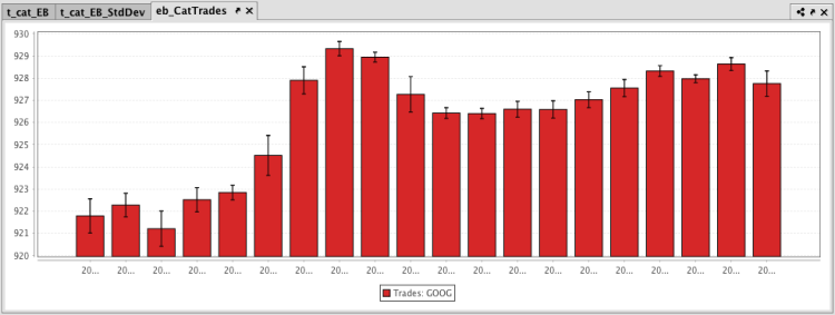
Example: catErrorBar
The query shown in the example below will plot the standard deviation in the value of Google trades every 20 minutes. The resulting chart will be plotted as a bar graph with error bars running vertically.
from deephaven import Plot

# source the data
t_cat_EB = db.t("LearnDeephaven", "StockTrades")\
    .where("Date = `2017-08-23`", "USym = `GOOG`")\
    .updateView("TimeBin=upperBin(Timestamp, 20 * MINUTE)")\
    .where("isBusinessTime(TimeBin)")

# calculate standard deviations for the upper and lower error values
t_cat_EB_StdDev = t_cat_EB.by(caf.AggCombo(caf.AggAvg("AvgPrice = Last"), caf.AggStd("StdPrice = Last")), "TimeBin")

# plot the data
eb_CatTrades = Plot.catErrorBar("Trades: GOOG", t_cat_EB_StdDev.update("AvgPriceLow = AvgPrice - StdPrice",
                                                                      "AvgPriceHigh = AvgPrice + StdPrice"),
                               "TimeBin", "AvgPrice", "AvgPriceLow", "AvgPriceHigh")\
    .show()
//source the data
t_cat_EB = db.t("LearnDeephaven", "StockTrades")
    .where("Date = `2017-08-23`", "USym = `GOOG`")
    .updateView("TimeBin=upperBin(Timestamp, 20 * MINUTE)")
    .where("isBusinessTime(TimeBin)")

//calculate standard deviations for the upper and lower error values
t_cat_EB_StdDev = t_cat_EB.by(AggCombo(AggAvg("AvgPrice = Last"), AggStd("StdPrice = Last")), "TimeBin")

//plot the data
eb_CatTrades = catErrorBar("Trades: GOOG", t_cat_EB_StdDev.update("AvgPriceLow = AvgPrice - StdPrice",
                                                                  "AvgPriceHigh = AvgPrice + StdPrice"),
                           "TimeBin", "AvgPrice", "AvgPriceLow", "AvgPriceHigh")
    .show()
The first code block gathers the data for the plot , telling Deephaven to access the StockTrades table in the LearnDeephaven namespace, and then filter it to include only the data for August 23, 2017, and only when the USym is GOOG. The data is downsampled (binned) for 20 minute intervals, and is then filtered again to include only the data that occurs within business hours. That data is then saved to a new variable named trades.
The second block of code calculates the average of the values in the Last column and the standard deviation of the values in the Last column. The results will appear in new columns, AvgPrice and StdPrice respectively, in the new table called t_EB_StdDev.
The third code block tells Deephaven:
- To create an
catErrorBarplot namedeb_CatTrades. - "
Trades: GOOG" is the series name. - The data needed for plotting is sourced from the
tradesStatstable. Then, two columns in that table are created in the table using the update method:AvgPriceLowis calculated by subtracting the standard deviation of the price from the average.AvgPriceHighis calculated by adding the average price to the standard deviation.
- Data from the
TimeBincolumn is to be used for the X value. - Data from the
AvgPricecolumn is to be used as the Y value. - Data from the
AvgPriceLowcolumn is to be used for low error value on the Y axis. - Data from the
AvgPriceHighcolumn is to be used for high error value on the Y axis. - The
.showmethod then tells Deephaven to present the plot in the Deephaven console.
The resulting plot is presented below.
For additional formatting options, please refer to:
Last Updated: 16 February 2021 18:07 -04:00 UTC Deephaven v.1.20200928 (See other versions)
Deephaven Documentation Copyright 2016-2020 Deephaven Data Labs, LLC All Rights Reserved