Plotting
In addition to the code snippets included below, all of the Groovy and Python code for the recipes below can be downloaded as premade Deephaven Notebooks. To learn more about using Deephaven Notebooks, please refer to the Notebook section of the User Manual.
Download the Query Cookbook Notebooks
The recipes in this section provide examples showing how Deephaven can help you visualize the data and its relationships through plotting.
Key concepts
- All charts in Deephaven are contained in a figure. Figures can hold individual plots or multiple plots.
- There are three basic steps to creating a chart in Deephaven.
- Select/source the data
- Build the chart
- Show the chart
- The following charting types are available in Deephaven:
- XY Series, including line, bar, scatter, area, and stacked area variations
- Category including bar, line, area, and stacked area variations
- Histogram
- Category Histogram
- Pie
- Open, High, Low and Close (OHLC)
XY Series
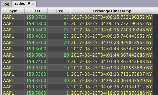
Step 1: Pull trades from a certain date and remove some columns.
trades = db.t("LearnDeephaven", "StockTrades")
.where("Date=`2017-08-25`")
.view("Sym", "Last", "Size", "ExchangeTimestamp")
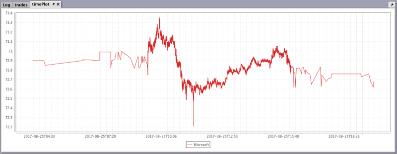
Step 2: Create a time plot based on the symbol's timestamps and prices.
timePlot = plot("Microsoft", trades.where("Sym=`MSFT`"), "ExchangeTimestamp", "Last")
.show()
Step 3: Add another plot for a different symbol's timestamps and prices.
multiSeries = plot("Microsoft", trades.where("Sym=`MSFT`"), "ExchangeTimestamp", "Last")
.plot("AAPL", trades.where("Sym=`AAPL`"), "ExchangeTimestamp", "Last")
.show()
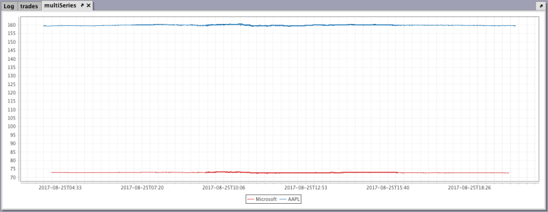
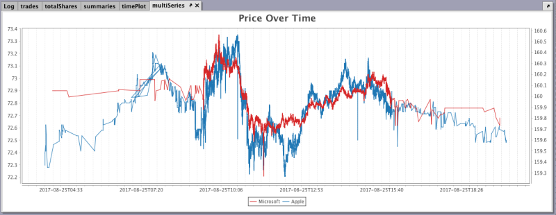
The plot for the second symbol is accurate, but the chart is not very helpful because of the range covered in the Y axis. There is too much of a difference between the symbols' prices, therefore both lines appear rather flat. This can be remedied by adding a second Y axis.
Step 4: Apply the twinX method to create a second Y axis.
multiSeries = plot("Microsoft", trades.where("Sym=`MSFT`"), "ExchangeTimestamp", "Last")
.twinX()
.plot("Apple", trades.where("Sym=`AAPL`"), "ExchangeTimestamp", "Last")
.show()
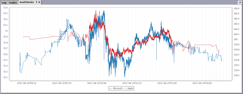
Step 5: Add a chart title.
multiSeries = plot("Microsoft", trades.where("Sym=`MSFT`"), "ExchangeTimestamp", "Last")
.twinX()
.plot("Apple", trades.where("Sym=`AAPL`"), "ExchangeTimestamp", "Last")
.chartTitle("Price Over Time")
.show()
Category
Step 1: Pull trades from a certain date and remove some columns.
trades = db.t("LearnDeephaven", "StockTrades")
.where("Date=`2017-08-25`")
.view("Sym", "Last", "Size", "ExchangeTimestamp")
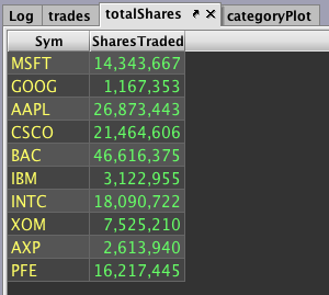
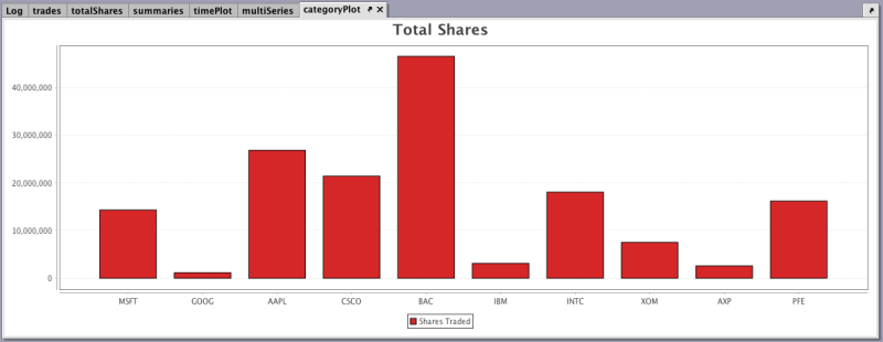
Step 2: Calculate the total number of shares traded for each symbol, create a category plot, and add a chart title.
totalShares = trades.view("Sym", "SharesTraded=Size").sumBy("Sym")
categoryPlot = catPlot("Shares Traded", totalShares, "Sym", "SharesTraded")
.chartTitle("Total Shares")
.show()
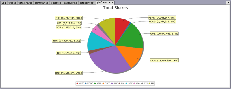
Pie
Step 1: Using the tables generated in the previous Category recipe, create a pie chart and add a chart title.
pieChart = piePlot("Shares Traded", totalShares, "Sym", "SharesTraded")
.chartTitle("Total Shares")
.show()
Histogram
Step 1: Pull trades from a certain date and remove some columns.
trades = db.t("LearnDeephaven", "StockTrades")
.where("Date=`2017-08-25`")
.view("Sym", "Last", "Size", "ExchangeTimestamp")
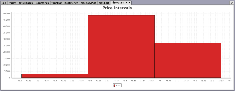
Step 2: Create a histogram counting a symbol's price across three intervals, and add the chart title.
histogram = histPlot("MSFT", trades.where("Sym=`MSFT`"), "Last", 3)
.chartTitle("Price Intervals")
.show()
Category Histogram
Step 1: Pull trades from a certain date and remove some columns.
trades = db.t("LearnDeephaven", "StockTrades")
.where("Date=`2017-08-25`")
.view("Sym", "Last", "Size", "ExchangeTimestamp")
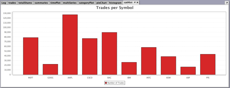
Step 2: Create a category histogram to show the amount of trades per symbol, and add a chart title.
catHist = catHistPlot("Number of Trades", trades, "Sym")
.chartTitle("Trades per Symbol")
.show()
Open, High, Low and Close
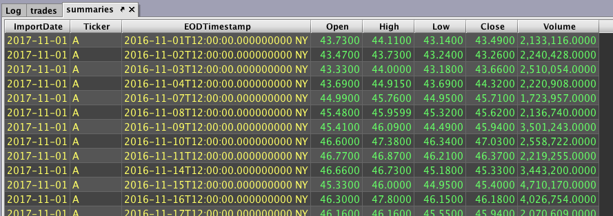
Step 1: Create a table to hold day summaries for each symbol over a year.
summaries = db.t("LearnDeephaven", "EODTrades").where("ImportDate=`2017-11-01`")
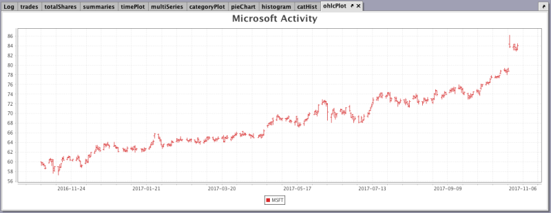
Step 2: Create a plot that presents the open, high, low, and closing prices of a symbol for each day, and add the chart title.
ohlcPlot = ohlcPlot("MSFT", summaries.where("Ticker=`MSFT`"), "EODTimestamp", "Open", "High", "Low","Close")
.chartTitle("Microsoft Activity")
.show()
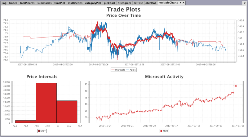
Grouping Multiple Plots in the Same Figure
This recipe demonstrates how to create a figure that contains multiple charts.
Note: All of the tables and plots used in the following recipe were created in the preceding Plotting recipes. Also, many of the methods used in this query are chained together, so the steps in producing the figure will be listed individually. However, the entire query execution will not be demonstrated until the last step of the recipe.
Step 1: Write the portion of the query to create a figure with two rows and three columns, and add a title for the figure.
multipleCharts = figure(2,3)
.figureTitle("Trade Plots")
.show()
Step 2: Insert the query for the first chart and allow it to span across all three columns.
Note: The chart used in this step is the same as that demonstrated in XY Series.
multipleCharts = figure(2,3)
.figureTitle("Trade Plots")
.colSpan(3)
.plot("Microsoft", trades.where("Sym=`MSFT`"), "ExchangeTimestamp", "Last")
.twinX()
.plot("Apple", trades.where("Sym=`AAPL`"), "ExchangeTimestamp", "Last")
.chartTitle("Price Over Time")
.show()
Step 3: Insert the query for the second chart.
Note: The chart used in this step is the same as that demonstrated in Histogram.
multipleCharts = figure(2,3)
.figureTitle("Trade Plots")
.colSpan(3)
.plot("Microsoft", trades.where("Sym=`MSFT`"), "ExchangeTimestamp", "Last")
.twinX()
.plot("Apple", trades.where("Sym=`AAPL`"), "ExchangeTimestamp", "Last")
.chartTitle("Price Over Time")
.newChart()
.histPlot("MSFT", trades.where("Sym=`MSFT`"), "Last", 3)
.chartTitle("Price Intervals")
.show()
Step 4: Insert the query for the third chart and allow it to span across two columns.
Note: The chart used in this step is the same as that demonstrated in OHLC.
The entire query is now complete.
multipleCharts = figure(2,3)
.figureTitle("Trade Plots")
.colSpan(3)
.plot("Microsoft", trades.where("Sym=`MSFT`"), "ExchangeTimestamp", "Last")
.twinX()
.plot("Apple", trades.where("Sym=`AAPL`"), "ExchangeTimestamp", "Last")
.chartTitle("Price Over Time")
.newChart()
.histPlot("MSFT", trades.where("Sym=`MSFT`"), "Last", 3)
.chartTitle("Price Intervals")
.newChart()
.colSpan(2)
.ohlcPlot("MSFT", summaries.where("Ticker=`MSFT`"), "EODTimestamp", "Open", "High", "Low","Close")
.chartTitle("Microsoft Activity")
.show()
Complete Code Blocks for all Plotting Recipes
trades = db.t("LearnDeephaven", "StockTrades")
     .where("Date=`2017-08-25`")
     .view("Sym", "Last", "Size", "ExchangeTimestamp")

timePlot = plot("Microsoft", trades.where("Sym=`MSFT`"), "ExchangeTimestamp", "Last")
     .show()

multiSeries = plot("Microsoft", trades.where("Sym=`MSFT`"), "ExchangeTimestamp", "Last")
     .twinX()
     .plot("Apple", trades.where("Sym=`AAPL`"), "ExchangeTimestamp", "Last")
     .chartTitle("Price Over Time")
     .show()

totalShares = trades.view("Sym", "SharesTraded=Size").sumBy("Sym")

categoryPlot = catPlot("Shares Traded", totalShares, "Sym", "SharesTraded")
     .chartTitle("Total Shares")
     .show()

pieChart = piePlot("Shares Traded", totalShares, "Sym", "SharesTraded")
     .chartTitle("Total Shares")
     .show()

histogram = histPlot("MSFT", trades.where("Sym=`MSFT`"), "Last", 3)
     .chartTitle("Price Intervals")
     .show()

catHist = catHistPlot("Number of Trades", trades, "Sym")
     .chartTitle("Trades per Symbol")
     .show()

summaries = db.t("LearnDeephaven", "EODTrades").where("ImportDate=`2017-11-01`")

ohlcPlot = ohlcPlot("MSFT", summaries.where("Ticker=`MSFT`"), "EODTimestamp", "Open", "High", "Low","Close")
     .chartTitle("Microsoft Activity")
     .show()

multipleCharts = figure(2,3)
      .figureTitle("Trade Plots")

.colSpan(3)
.plot("Microsoft", trades.where("Sym=`MSFT`"), "ExchangeTimestamp", "Last")
     .twinX()
.plot("Apple", trades.where("Sym=`AAPL`"), "ExchangeTimestamp", "Last")
     .chartTitle("Price Over Time")

.newChart()
     .histPlot("MSFT", trades.where("Sym=`MSFT`"), "Last", 3)
     .chartTitle("Price Intervals")

.newChart()
     .colSpan(2)
     .ohlcPlot("MSFT", summaries.where("Ticker=`MSFT`"), "EODTimestamp", "Open", "High", "Low","Close")
     .chartTitle("Microsoft Activity")
.show()
# Initial import
from deephaven import *
print("Provides:\n"
"\tdeephaven.Calendars as cals\n"
"\tdeephaven.ComboAggregateFactory as caf\n"
"\tdeephaven.DBTimeUtils as dbtu\n"
"\tdeephaven.Plot as plt\n"
"\tdeephaven.Plot.figure_wrapper as figw\n"
"\tdeephaven.QueryScope as qs\n"
"\tdeephaven.TableManagementTools as tmt\n"
"\tdeephaven.TableTools as ttools\n"
"See print(sorted(dir())) for the full namespace contents.")
# XY Series
trades = db.t("LearnDeephaven", "StockTrades")\
.where("Date=`2017-08-25`")\
.view("Sym", "Last", "Size", "ExchangeTimestamp")
timePlot = plt.plot("Microsoft", trades.where("Sym=`MSFT`"), "ExchangeTimestamp", "Last")\
.show()
multiSeries = plt.plot("Microsoft", trades.where("Sym=`MSFT`"), "ExchangeTimestamp", "Last")\
.twinX()\
.plot("Apple", trades.where("Sym=`AAPL`"), "ExchangeTimestamp", "Last")\
.chartTitle("Price Over Time")\
.show()
# Category
trades = db.t("LearnDeephaven", "StockTrades")\
.where("Date=`2017-08-25`")\
.view("Sym", "Last", "Size", "ExchangeTimestamp")
totalShares = trades.view("Sym", "SharesTraded=Size").sumBy("Sym")
categoryPlot = plt.catPlot("Shares Traded", totalShares, "Sym", "SharesTraded")\
.chartTitle("Total Shares")\
.show()
# Pie
trades = db.t("LearnDeephaven", "StockTrades")\
.where("Date=`2017-08-25`")\
.view("Sym", "Last", "Size", "ExchangeTimestamp")
pieChart = plt.piePlot("Shares Traded", totalShares, "Sym", "SharesTraded")\
.chartTitle("Total Shares")\
.show()
# Histogram
trades = db.t("LearnDeephaven", "StockTrades")\
.where("Date=`2017-08-25`")\
.view("Sym", "Last", "Size", "ExchangeTimestamp")
histogram = plt.histPlot("MSFT", trades.where("Sym=`MSFT`"), "Last", 3)\
.chartTitle("Price Intervals")\
.show()
# Category Histogram
trades = db.t("LearnDeephaven", "StockTrades")\
.where("Date=`2017-08-25`")\
.view("Sym", "Last", "Size", "ExchangeTimestamp")
catHist = plt.catHistPlot("Number of Trades", trades, "Sym")\
.chartTitle("Trades per Symbol")\
.show()
# Open, High, Low and Close
summaries = db.t("LearnDeephaven", "EODTrades").where("ImportDate=`2017-11-01`")
ohlcPlot = plt.ohlcPlot("MSFT", summaries.where("Ticker=`MSFT`"), "EODTimestamp", "Open", "High", "Low", "Close")\
.chartTitle("Microsoft Activity")\
.show()
# Grouping Multiple Plots in the Same Figure
trades = db.t("LearnDeephaven", "StockTrades")\
.where("Date=`2017-08-25`")\
.view("Sym", "Last", "Size", "ExchangeTimestamp")
summaries = db.t("LearnDeephaven", "EODTrades").where("ImportDate=`2017-11-01`")
multipleCharts = plt.figure(2, 3)\
.figureTitle("Trade Plots")\
\
.colSpan(3)\
.plot("Microsoft", trades.where("Sym=`MSFT`"), "ExchangeTimestamp", "Last")\
.twinX()\
.plot("Apple", trades.where("Sym=`AAPL`"), "ExchangeTimestamp", "Last")\
.chartTitle("Price Over Time")\
\
.newChart()\
.histPlot("MSFT", trades.where("Sym=`MSFT`"), "Last", 3)\
.chartTitle("Price Intervals")\
\
.newChart()\
.colSpan(2)\
.ohlcPlot("MSFT", summaries.where("Ticker=`MSFT`"), "EODTimestamp", "Open", "High", "Low", "Close")\
.chartTitle("Microsoft Activity")\
\
.show()
Last Updated: 16 February 2021 18:06 -04:00 UTC Deephaven v.1.20200928 (See other versions)
Deephaven Documentation Copyright 2016-2020 Deephaven Data Labs, LLC All Rights Reserved