Working With Plots
Overview
Users can create charts in Deephaven by using a Deephaven query, or directly in the user interface. The following documentation discusses how to create and edit plots in the Deephaven user interface. To create plots using query language, see: Plotting Methods.
After a plot has been created in the console, right-click shortcuts are available that can help you manipulate content in the plot. Some options include saving and printing the chart, while others provide the means to change aspects within the displayed chart.
Create Plot
Users can create plots directly in the user interface using the Create Plot option in the right-click table data menu. Plots created using this option will not appear in the Show Widget menu. However, these plots can be saved as part of your workspace and will reappear when you open a saved workspace.
To create a plot in the user interface, first open the table containing your data in the Deephaven console. Then, right-click anywhere within the table data to access the Create Plot option.
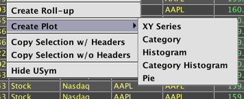
There are five chart types available:
Each type will be discussed below.
XY Series
For our first example, we will create an XY Series Plot from the "EODTrades" table created by the following query:
t1 = db.t("LearnDeephaven", "EODTrades").where("ImportDate=`2017-11-01`" , "Ticker=`A`")
Right-click anywhere in the table to access the Create Plot menu, then select XY Series. The Create Plot editor opens, as shown below:
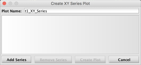
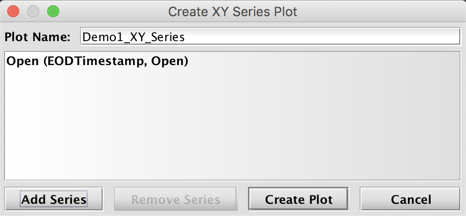
To configure the data in your plot, select Add Series.
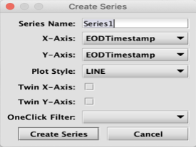
For all chart types, users can type a new name for the series in the first field. Options specific to an XY Series chart follow: X-Axis, Y-Axis, and Plot Style. Users can set these values using the drop-down menus in each field. There are also options to choose whether to twin the X or Y-Axis, and to pair the plot with a OneClick filter. We will not use these options for this example. However, more info about pairing plots with a OneClick filter is discussed in Example 3 below, and creating two Y axes is demonstrated in Example 4 below.
Example 1: Single Series
In this example, we are going to name the series "Open", select EODTimestamp for the X-Axis, select Open for the Y-Axis, and make a selection from the Plot Style drop-down menu. (To learn more about these styles, see Plot Styles.) There are four options available for an XY Series plot: Line, Scatter, Area, and Bar. LINE is the default, which we will use in this example, as shown below:
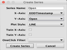
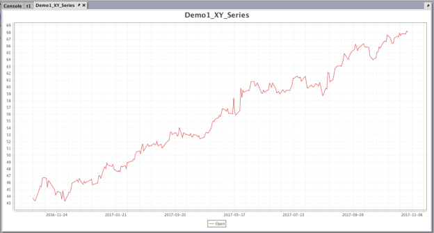
Once our selections have been made, we can click Create Series. The selections are recorded in the Create Plot dialog, where you can type in a name for your plot, in this case Demo1_XY_Series.
If you want to remove a series that you have already added, select the series and click Remove Series. In order to edit your selections in a series, you must remove it and re-add that series with your desired changes.
Because we are only going to plot a single series in this example, we can now select Create Plot.
Note: At this time, you cannot edit your selections after you select Create Plot. You will need to create a new plot.
Example 2: Multiple Series
It is possible to plot multiple series in the same chart. At this time, users cannot edit a chart already created, so we will need to create a new plot if we want to add another series.
We're going to create the first series in this new chart using the same query and process used for Demo1_XY_Series. However, before we select Create Plot, we're going to click Add Series to create a second series in the chart.
We'll name the second series "Close", select EODTimestamp for the X-Axis, select Close for the Y-Axis, and repeat the selection of LINE from the Plot Style drop-down menu. Once our selections for the second series have been made, we can click Create Series. Both series and their respective selections are now recorded in the Create Plot dialog, as shown below.
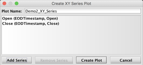
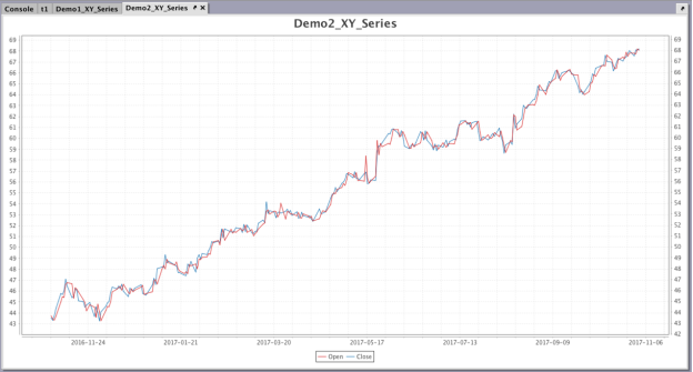
Once we click Create Plot, Demo2_XY_Series opens in the console.
You can pair OneClick filters with any plot created in the user interface if you configure the OneClick Filter field in the Create Series editor.
In the first two examples our initial query filtered the "EODTrades" table to the Ticker A. Normally, to include other symbols for plotting, you would need to rewrite the underlying query. However, when creating plots in the user interface, this can be accomplished by pairing your plot with a OneClick filter in the console. Similarly, if you wanted to see the price of a single security over time, without creating a new plot each time, you could use a OneClick filter to change the table data for each Sym.
For this example, we will use the following query to create our initial table using data from "StockTrades":
t2 = db.t("LearnDeephaven", "StockTrades").where("Date=`2017-08-24`")
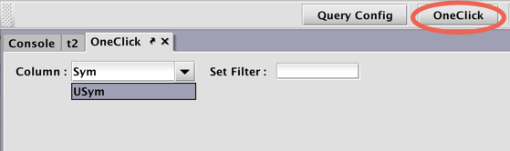
First, create a new OneClick panel by clicking the OneClick button at the top of the Deephaven console. The column option defaults to USym. For this example, we will change this to Sym by typing our own value in the field.
Click the tab in the console to bring the panel containing the t2 table to the foreground. Then right-click in the table and select Create Plot > XY Series.
For this plot, we will select Timestamp as our X-Axis value, Last as our Y-Axis value, and use LINE as the Plot Style. We'll also click in the OneClick Filter drop-down menu and select Sym.
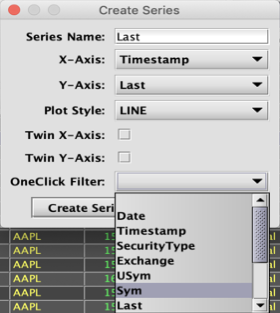
Note: The filter selected in the Create Series editor must match the Column entry in the OneClick panel.
Once our selections have been made, we can click Create Series. The selections are recorded in the Create Plot dialog.
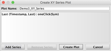
Click Create Plot.
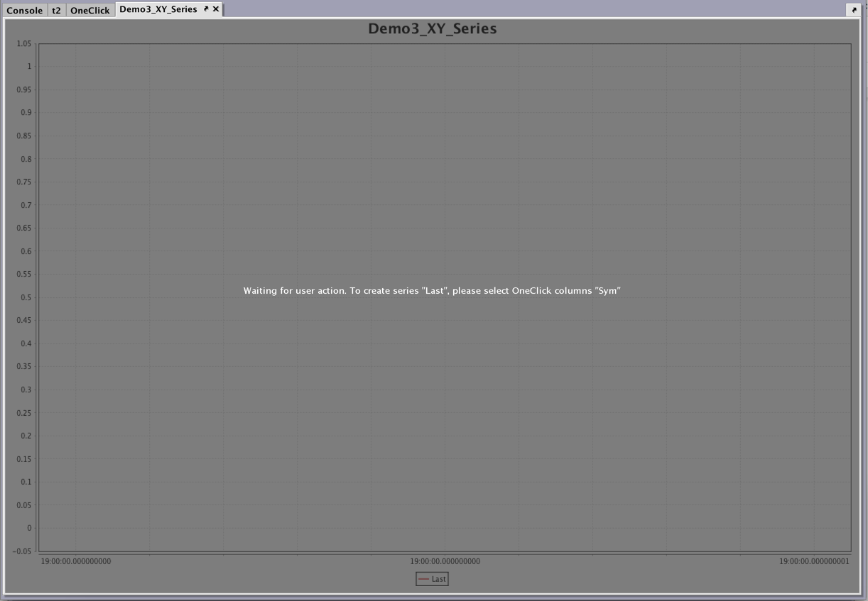
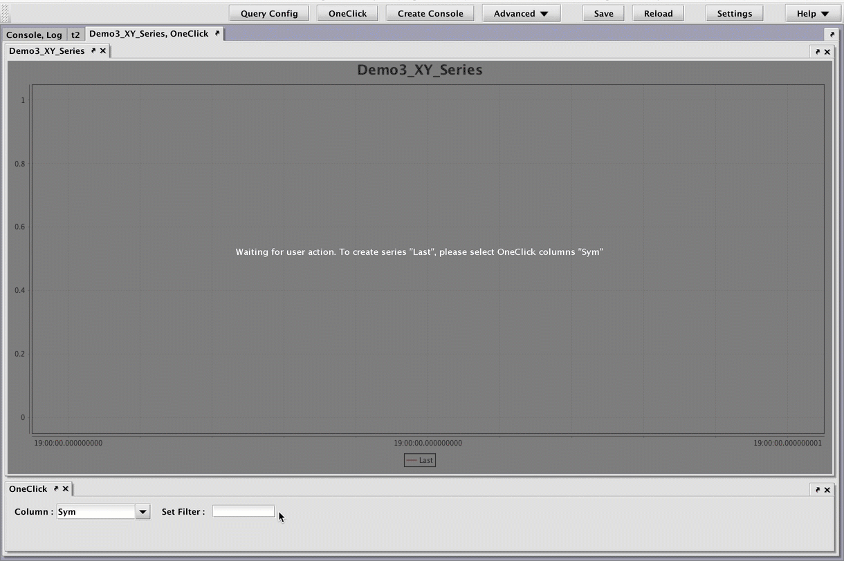
The plot window for DemoPlot3_XY_Series will be created in the console as shown below. The plot has not yet been paired with the OneClick filter, so a selection of the Sym to plot is not yet possible.
You will need to pair the OneClick panel with the plot by nesting them together. To do so, first click on the tab for the OneClick panel to bring it to the foreground. Then click and drag the tab for Demo3_XY_Series until it is on top of the panel for the OneClick filter and release the mouse. The two panels should now be nested together.
To see a chart for a particular Sym, type the appropriate value into the Set Filter field and press Return or Enter. The animation below shows the OneClick filter being used to quickly change the Sym being plotted to AAPL then GOOG.
If you nest multiple plots in the same OneClick panel, all plots will filter accordingly. You can also nest a plot in a different OneClick panel to have it filter uniquely.
To learn more about OneClick filters, see: OneClick.
It is possible to twin either the X or Y axis to accommodate a large range of values. For example, part of a series would be plotted on a Y axis with its values on the left of the graph, and the other part of the series would be plotted on a Y axis with its value on the right of the graph, while sharing the share X axis.
For this example, we will plot two series on their own Y axis, using the following query to create our initial table:
t2 = db.t("LearnDeephaven", "StockTrades").where("Date=`2017-08-24`")
This plot requires two series. In the first series, we will select Timestamp as our X-Axis value, Last as our Y-Axis value, and use LINE as the Plot Style. We will include a OneClick Filter, set to Sym. We also need to select the Twin X-Axis checkbox so that the series share the X-axis:
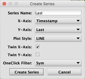
Click Create Series, then repeat the process, selecting Size as the Y-Axis value, and again selecting the Twin X-Axis checkbox:
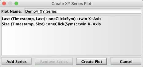
After clicking Create Plot, the plot window for DemoPlot4_XY_Series will be created in the console, but will need to be paired with a OneClick filter. At this time you cannot create multiple series for individual Syms, so we will use the OneClick to filter the table to one Sym at a time.
Once the panels are nested together, you can specify which Sym to plot. In the image below, the chart renders after GOOG is typed into the OneClick filter:
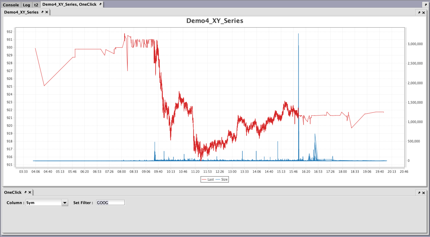
Both series, Last and Size, share the same X axis. The Y-axis to the left displays the values for the Last series, while the Y-axis to the right displays the values for the Size series.
Category Chart
The process to create other chart types is similar. However, we will review some key differences. In the next example, we will create a Category Plot with a single series.
For our Category chart, we will use the following query to create a table from "StockQuotes" data:
t3=db.t("LearnDeephaven", "StockQuotes").where("Date=`2017-08-25`")
Right-click anywhere in the table to access the Create Plot menu, then select Category. The Create Series editor includes fields for Category and Value columns, in addition to the universal options, Series Name and OneClick Filter.
We'll name our series "BidSize," then select USym from the Category Column drop-down menu and BidSize from the Value Column drop-down menu.
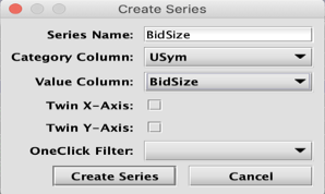
Once our selections have been made, we can click Create Series. The selections are recorded in the Create Plot dialog, where we can type Demo5_Category in the Plot Name field.
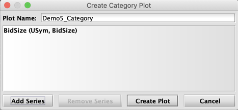
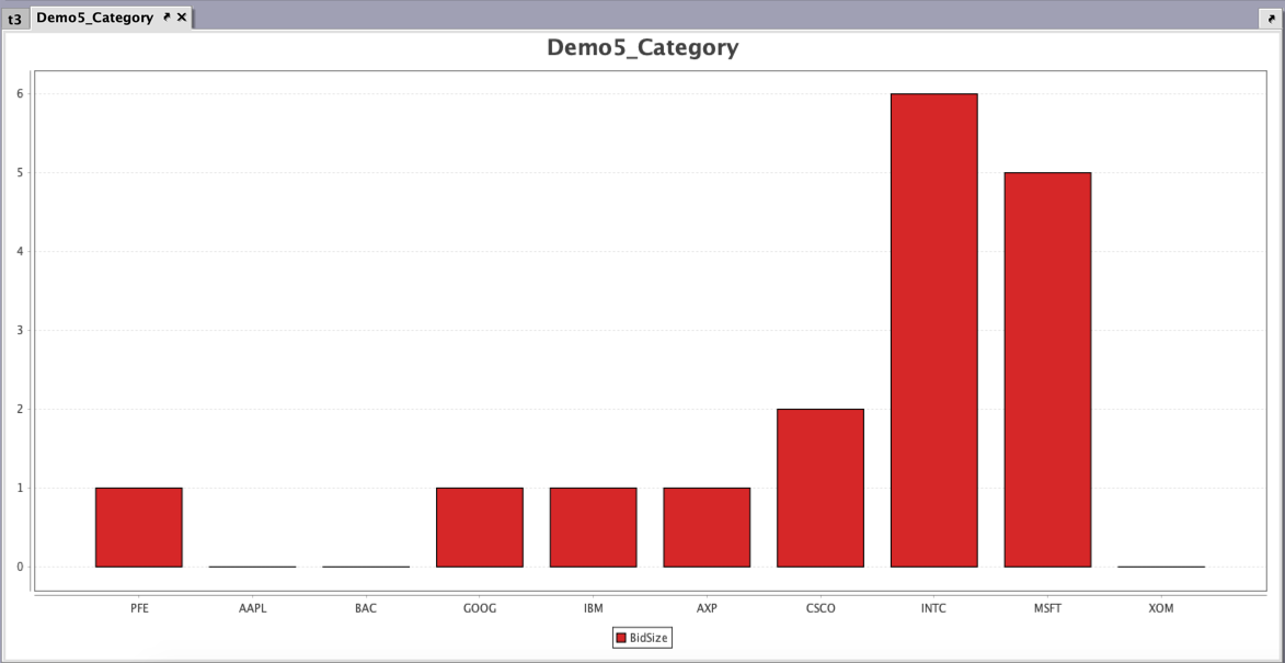
Click Create Plot.
Histogram
In this example, we will create a Histogram paired with a OneClick filter.
For our histogram, we will use the following query to create a table from "StockTrades" data:
t4=db.t("LearnDeephaven", "StockTrades").where("Date=`2017-08-25`")
Right click in the table, select Create Plot, and then select Histogram.
The Create Series editor now includes a Value Column field with a drop-down menu, and a Bins field with arrows to increase or decrease the number of intervals to use in the chart, in addition to the universal options of Series Name and OneClick Filter.
![]()
In this example, we will name the series "Last", then select Last as the Value Column. Then, we can enter 10 in the Bins field to include 10 intervals in the histogram. We'll also click in the OneClick Filter drop-down menu and select USym. Then click Create Series.
In the next window, type Demo6_Histogram in the Plot Name field.
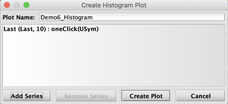
Click Create Plot.
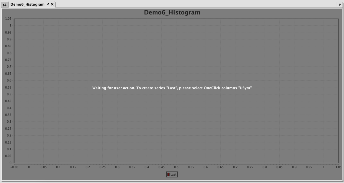
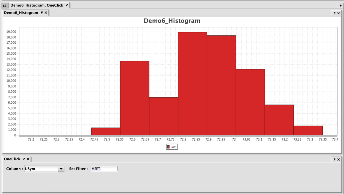
The plot window for Demo6_Histogram will be created in the console as shown above. The plot has not yet been paired with the OneClick filter, so a selection of the USym to plot is not yet possible. We must now create a new OneClick panel by clicking the OneClick button at the top of the Deephaven console. The default column option, USym, already matches our filter in the series. Next, click and drag the tab for Demo6_Histogram until it is on top of the panel for the OneClick filter and release the mouse. The two panels should now be nested together.
To see a chart for a particular USym, type the appropriate value into the Set Filter field and press Return or Enter. In this case, we will filter the histogram to MSFT.
Category Histogram
In this example, we will create a Category Histogram, starting with the following query to create a table from "StockTrades" data:
t4=db.t("LearnDeephaven", "StockTrades").where("Date=`2017-08-25`")
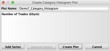
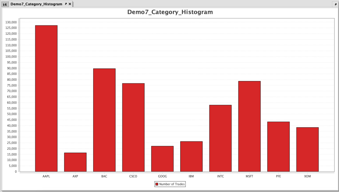
Right click in the table, select Create Plot and then select Category Histogram. The Create Series editor only presents a Value Column field in addition to the universal options, Series Name and OneClick Filter. For this plot, we will create one series called "Number of Trades" using USym as the Value Column, without a OneClick filter.
![]()
Click Create Series. In the next window, type Demo7_CategoryHistogram in the Plot Name field.
Click Create Plot.
Pie
In this example, we will create a Pie chart from a table created from the following query:
t4=db.t("LearnDeephaven", "StockTrades").where("Date=`2017-08-24`").
Right click in the table, select Create Plot and then select Pie. The Create Series editor includes options for Category and Value Columns, in addition to the universal options of Series Name and OneClick Filter.
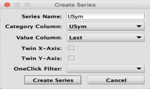
We'll set the Category Column to USym, and the Value Column to Last. We will not pair our plot with a OneClick filter for this example. Click Create Series.
In the next window, type Demo8_Pie in the Plot Name field.
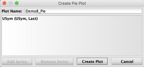
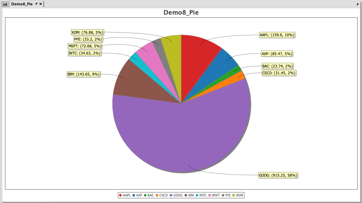
When creating a pie chart, you can only add one series. Once the first series is created, the Add Series button becomes unavailable. Finally, click Create Plot to generate the Demo8_Pie panel in the console.
To learn more about the individual plotting methods see: Plotting Methods.
Right-click Shortcuts
After a plot has been created by a query or with Create Plot in the user interface, right-click shortcuts are available that can help you manipulate content in the plot. Some options include saving and printing the chart, while others provide the means to change aspects within the displayed chart. For example, users can choose to change background colors, fonts/color, the range of data displayed and/or zoom in/out.
While the appearance of the chart can be changed, the manipulations performed after the plot has been generated by the query only impact the presentation of the original table in the Deephaven console. These alterations do not change any of the underlying values created by the original query. If you rerun the query, any manual changes previously made to the original chart presentation through the right-click menus will be discarded, even if you save the workspace.
The screenshot below shows the options available when right-clicking on a plot.
Properties
When Properties is selected in the right-click menu, the following dialog window is generated:
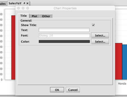
Three tabs are available: Title, Plot, and Other.
Title
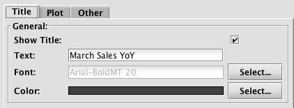
The Title tab provides options for adding (or editing) a title to your chart. If your original query for this chart did not include the creation of a chart title, you can add a title now by selecting the check box for Show Title, and then typing the chart title into Text field. You can also adjust the font and the font color for the title.
If your original query included the creation of a chart title, you can use the options in this window to edit or hide the title.
Plot
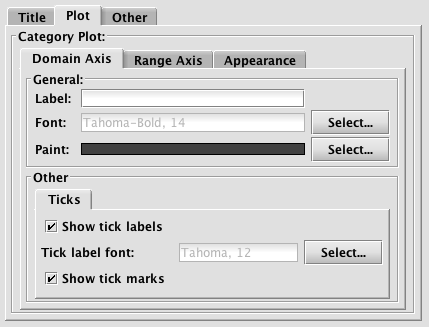
The content shown in the Plot tab enables you to add/edit items related to the plot of your chart. As such, the options shown will vary based on the type of plot performed. The example shown above presents the options for a Category Plot, which includes properties for each of the axes' labels and tick labels/marks, as well as the Appearance of the entire plot, including background color. Another option shown on the Appearance tab for Category Plots is an orientation setting that allows you to orient the bars vertically or horizontally.
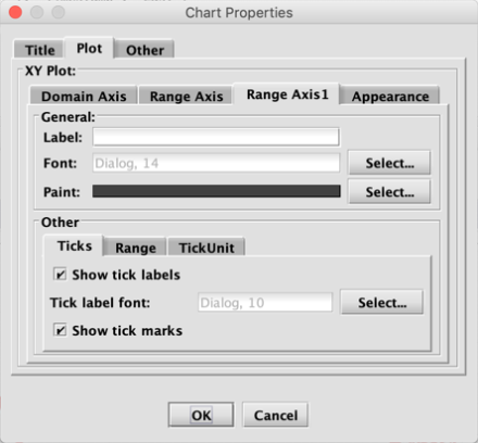
Since the options shown on the Plot tab are dependent upon the type of chart you are plotting, the options available will vary. For example, the Plot tab for an XY series chart with multiple Y axes will include an additional tab, as shown below:
The Plot tab for a pie chart will only show values pertaining to Appearance because there are no X or Y axes with pie charts, as shown below.
![]()
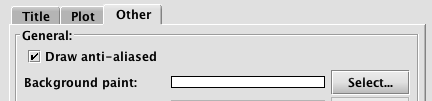
Other
The Other tab presents options for drawing the chart with anti-aliasing turned on or off, and for changing the background paint of the chart, as shown below.
Copy
When Copy is selected in the right-click menu, the entire chart is copied to your system's clipboard. You can then paste the graphic into another application as needed.
Save as
When SaveAs is selected in the right-click menu, a dialog window will open and prompt you for the location on your system to save the chart as a PNG file.
When Print is selected in the right-click menu, a dialog window will open and prompt you to review options for Page Setup. After reviewing or making any changes, select OK to bring up the Print dialog window. Select the appropriate options in that dialog window and then click Print to print the chart.
Zoom In
When Zoom In is selected in the right-click menu, you will be presented with three options. You can zoom in (get a closer view) on the chart based on (1) both axes, (2) the domain axis (X) or (3) the range axis (Y). Note: The options available are dependent upon the type of chart being used. For example, a line chart can zoom in/out on both axes, a category chart can zoom in/out only on the range (Y) axis, and a pie chart will not be able to zoom at all.
Zoom Out
When Zoom Out is selected in the right-click menu, you will be presented with up to three options. You can zoom out (get a wider view) on the chart based on (1) both axes, (2) the domain axis (X) or (3) the range axis (Y). Note: The options available are dependent upon the type of chart being used. For example, a line chart can zoom in/out on both axes, a category chart can zoom in/out only on the range (Y) axis, and a pie chart will not be able to zoom at all.
Auto Range
Auto Range is the final option in the right click menu. Selecting this option enables Deephaven to automatically reset the entire range for one or more axes. This is particularly useful when you have already zoomed in or zoomed out of the chart and would like to return the range of the axes to normal.
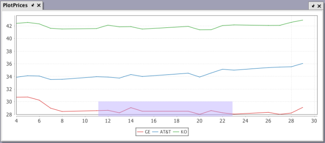
Click-and-Drag Zooming
Perhaps the easiest way to zoom in to a specific area on a plot is to use the click-and-drag method. To do so, you can simply 'draw' a box with your mouse cursor over the area you want to enlarge. For example, if we click and drag over the lower area of the chart between 12 and 22, a light purple box will show the area to be enlarged as shown below:
When the mouse button is released, the range of the chart will change to reflect only that area, as shown in the following image:
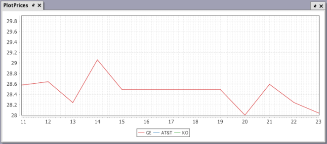
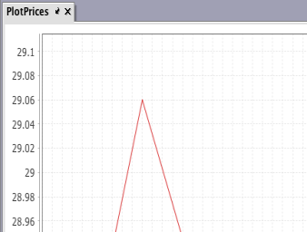
You can keep using this method to zoom closer and closer to a specific point on the chart. For example, if we draw the box over the tip of the highest point on the chart above, we can see the value at that point is 29.06.
Once you have completed your analysis using the click-and-drag zooming method, you can return the chart to its normal size and range by right-clicking on the chart and selecting Auto Range > Both Axes.
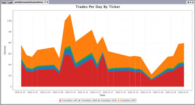
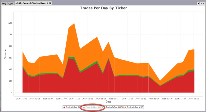
Toggling Series Visibility
When multiple series are presented in plot, users may find it useful to temporarily hide one or more of the series in the plot to better compare a smaller set of results. The visibility of any series in a plot can be toggled by clicking on the series name in the legend of the plot.
- Clicking one time hides the series; clicking again shows the series.
- Double-clicking a series hides the others; double-clicking again restores all series.
Original
One Series Toggled Off
One Series Visible (Double-click)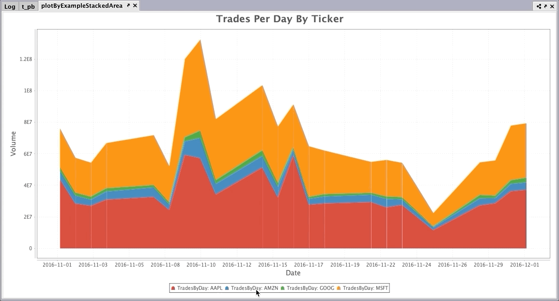
Last Updated: 16 February 2021 18:07 -04:00 UTC Deephaven v.1.20200928 (See other versions)
Deephaven Documentation Copyright 2016-2020 Deephaven Data Labs, LLC All Rights Reserved