XY Series Plots
An XY series plot is generally used to show values over a continuum, such as time. XY Series plots can be represented as a line, a bar, an area or as a collection of points. The X axis is used to show the domain, while the Y axis shows the related values at specific points in the range. XY Series plots display the values of data as lines (default). However, by using plotting styles, the data can be represented as a bar, a stacked bar, an area, a stacked area, or as a scatterplot.
Data Sourcing
XY Series plots can be created using data from tables, arrays and functions.
Creating an XY Series Plot using Data from a Table
When data is sourced from a table, the following syntax can be used to create an XY Series plot:
plot("SeriesName", source, "xCol", "yCol")
plotis the method used to create an XY series plot."SeriesName"is the name (as a string) you want to use to identify the series on the plot itself.sourceis the table that holds the data you want to plot."xCol"is the name of the column of data to be used for the X value."yCol"is the name of the column of data to be used for the Y value.
Example - XY Series Plot
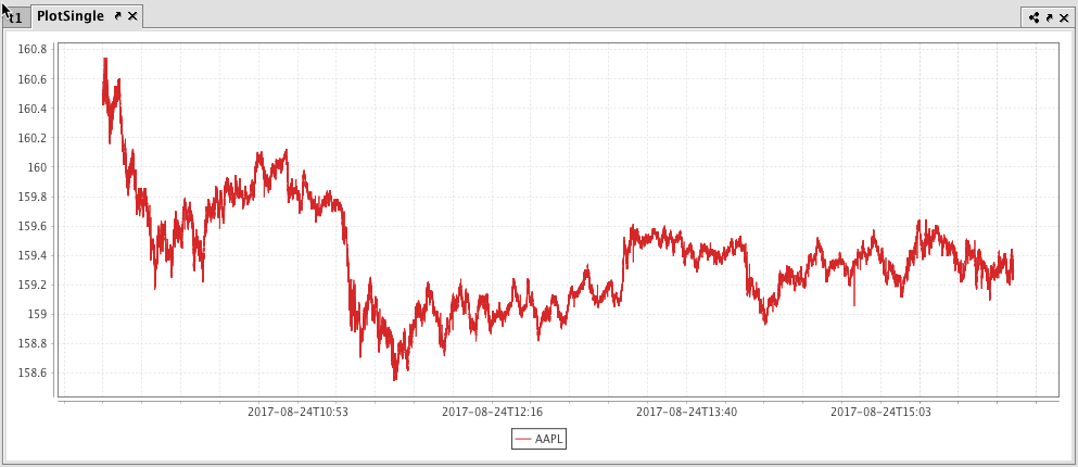
The example query below will create an XY series plot that shows the price of a single security (AAPL) over time.
from deephaven import *

# source the data
t1 = db.t("LearnDeephaven", "StockTrades").where("Date=`2017-08-24`", "USym=`AAPL`")

# plot the data
PlotSingle = plt.plot("AAPL", t1.where("USym = `AAPL`"), "Timestamp", "Last")\
    .xBusinessTime()\
    .show()
//source the data
t1 = db.t("LearnDeephaven","StockTrades").where("Date=`2017-08-24`","USym=`AAPL`")

//plot the data
PlotSingle = plot("AAPL", t1.where("USym = `AAPL`"), "Timestamp", "Last")
        .xBusinessTime()
        .show()
The first code block gathers the data for the plot, telling Deephaven to access the StockTrades table in the LearnDeephaven namespace; and then filter it to include only the data for August 24, 2017, and only when the USym is AAPL. That data is then saved to a new variable named t1.
The second code block tells Deephaven to create an XY series plot named PlotSingle. AAPL is the series name; it uses data from the t1 table. Data from the Timestamp column should be used for the X value, and data from the Last column should be used as the Y value. The xBusinessTime method limits the data to actual business hours, and the .show method then tells Deephaven to present the plot in the Deephaven console.
The resulting plot is presented below.
Creating an XY Series Plot using Data from an Array
When data is sourced from an array, the following syntax can be used to create an XY Series plot:
plot("SeriesName", [x], [y])
plotis the method used to create an XY series plot."SeriesName"is the name (as a string) you want to use to identify the series on the plot itself.[x]is the array containing the data to be used for the X value[y]is the array containing the data to be used for the Y value
Creating an XY Series Plot using Data from a Function
When data is sourced from a function, the following syntax can be used to create an XY Series plot:
plot("SeriesName", function)
plotis the method used to create an XY series plot."SeriesName"is the name (as a string) you want to use to identify the series on the plot itself.functionis a mathematical operation that maps one value to another. Examples of Groovy functions and their formatting follow:{x->x+100}adds 100 to the value of x{x->x*x}squares the value of x{x->1/x}uses the inverse of x{x->x*9/5+32}Fahrenheit to Celsius conversion
Special Considerations When Plotting from a Function
If you are plotting a function in a plot by itself, you should consider applying a range for the function using the funcRange or xRange method. Otherwise, the default value ([0,1]) will be used, which may not meet your requirements. For example:
plot("Function", {x->x*x} ).funcRange(0,10)
If the function is being plotted with other data series, the funcRange method is not needed, and the range will be obtained from the other data series.
When using a function plot, you may also want to increase or decrease the granularity of the plot by declaring the number of points to include in the range. This is configurable using the funcNPoints method. For example:
plot("Function", {x->x*x} ).funcRange(0,10).funcNPoints(55)
XY Series Plotting Options
XY Series with Shared Axes
You can also compare multiple series over the same period of time by creating an XY series plot with shared axes. In the following example, two series are plotted, thereby creating two line graphs on the same plot. The code to source and plot the second dataset is highlighted below:
from deephaven import *

# source the data
t2 = db.t("LearnDeephaven", "StockTrades")\
    .where("Date=`2017-08-24`", "USym in `INTC`,`CSCO`")

# plot the data
plotSharedAxis = plt.plot("INTC", t2.where("USym = `INTC`"), "Timestamp", "Last")\
    .plot("CSCO", t2.where("USym = `CSCO`"), "Timestamp", "Last")\
    .xBusinessTime()\
    .show()
//source the data
t2 = db.t("LearnDeephaven","StockTrades")
        .where("Date=`2017-08-24`","USym in `INTC`,`CSCO`")

//plot the data
plotSharedAxis = plot("INTC", t2.where("USym = `INTC`"), "Timestamp", "Last")
        .plot("CSCO", t2.where("USym = `CSCO`"), "Timestamp", "Last")
        .xBusinessTime()
        .show()
The resulting plot with two series is shown below.
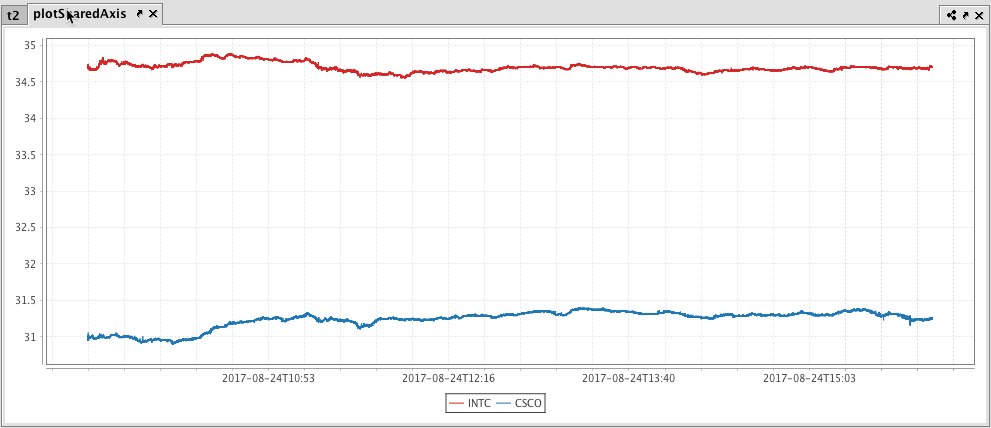
Subsequent series can be added to the plot by adding additional plot() methods to the query. However, the plotBy() method can also be used to do this. See plotBy().
XY Series Chart with Multiple X or Y Axes
When plotting multiple series in a single plot, the range of the Y axis is an important factor to watch. In the previous example, both securities had values within in a relatively narrow range (31 to 35). Therefore, any change in values was easy to visualize. However, as the range of the Y axis increases, those changes become harder to visualize.
To demonstrate this, we will plot AAPL and GOOG on the same chart (see query below).
from deephaven import *

# source the data
t3 = db.t("LearnDeephaven", "StockTrades").where("Date=`2017-08-24`", "USym in `AAPL`,`GOOG`")

# plot the data
plotShared2 = plt.plot("AAPL", t3.where("USym = `AAPL`"), "Timestamp", "Last")\
    .plot("GOOG", t3.where("USym = `GOOG`"), "Timestamp", "Last")\
    .xBusinessTime()\
    .show()
//source the data
t3 = db.t("LearnDeephaven","StockTrades").where("Date=`2017-08-24`","USym in `AAPL`,`GOOG`")

//plot the data
plotShared2 = plot("AAPL", t3.where("USym = `AAPL`"), "Timestamp", "Last")
        .plot("GOOG", t3.where("USym = `GOOG`"), "Timestamp", "Last")
        .xBusinessTime()
        .show()
When we plot AAPL and GOOG together, the scale of the Y axis now needs to cover a much wider range - from 150 to 950. As you can see in the plot below, using a range this large results in relatively flat lines with barely distinguishable differences in values or trend.
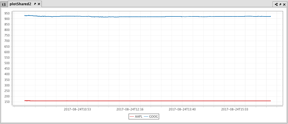
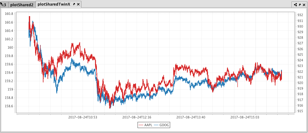
This issue can be easily remedied by adding a second Y axis to the plot via the twinX method.
The twinX() Method
The twinX() method enables you to use one Y axis for some of the series being plotted and a second Y axis for the others, while sharing the same X axis. The syntax for this follows:
PlotName = figure()
.plot(...) //plot(s) placed before twinX() use the left Y axis
.twinX()
.plot(...) //plot(s) placed after twinX() use the right Y axis
The plots for the series placed before the twinX() method share a common Y axis (on the left), while the plot(s) for the series listed after the twinX() method share a common Y axis on the right. All plots share the same X axis.
XY Series Plot Example Using the twinX() method
from deephaven import *

# source the data
t3 = db.t("LearnDeephaven", "StockTrades").where("Date=`2017-08-24`", "USym in `AAPL`,`GOOG`")

# plot the data
plotSharedTwinX = plt.plot("AAPL", t3.where("USym = `AAPL`"), "Timestamp", "Last")\
    .twinX()\
    .plot("GOOG", t3.where("USym = `GOOG`"), "Timestamp", "Last")\
    .xBusinessTime()\
    .show()
//source the data
t3 = db.t("LearnDeephaven","StockTrades").where("Date=`2017-08-24`","USym in `AAPL`,`GOOG`")

//plot the data
plotSharedTwinX = plot("AAPL", t3.where("USym = `AAPL`"), "Timestamp", "Last")
    .twinX()
    .plot("GOOG", t3.where("USym = `GOOG`"), "Timestamp", "Last")
    .xBusinessTime()
    .show()
When the code shown above is processed, the value range for AAPL isshown on the left axis and the value range for GOOG is shown on the right axis.
The twinY() Method
The twinY() method enables you to use one X axis for one set of the values being plotted and a second X axis for another, while sharing the same Y axis. The syntax for this follows:
PlotName = figure()
.plot(...) //plot(s) placed before twinY() use the lower X axis
.twinY()
.plot(...) //plot(s) placed after twinY() use the upper X axis
Additional Formatting Options
Using Plotting Styles with XY Series Plots
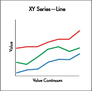
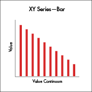
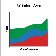
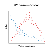
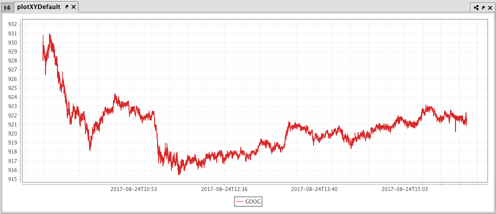
The XY series plot in Deephaven will default to a line plot. However, Deephaven's plotStyle() method can be used to format XY series plots as area charts, stacked area charts, bar charts, stacked bar charts, scatter charts and step charts. To demonstrate, the following query will generate an XY series plot. There is no plotting style assigned, so the plot will show as a line, which is the default.
Plot XY Series as Line (default)
from deephaven import *

# source the data
t4 = db.t("LearnDeephaven", "StockTrades").where("Date=`2017-08-24`", "USym=`GOOG`")

# plot the data
PlotXYDefault = plt.plot("GOOG", t4.where("USym = `GOOG`"), "Timestamp", "Last")\
    .xBusinessTime()\
    .show()
# source the data
t4 = db.t("LearnDeephaven", "StockTrades").where("Date=`2017-08-24`", "USym=`GOOG`")

# plot the data
PlotXYDefault = plot("GOOG", t4.where("USym = `GOOG`"), "Timestamp", "Last")
    .xBusinessTime()
    .show()
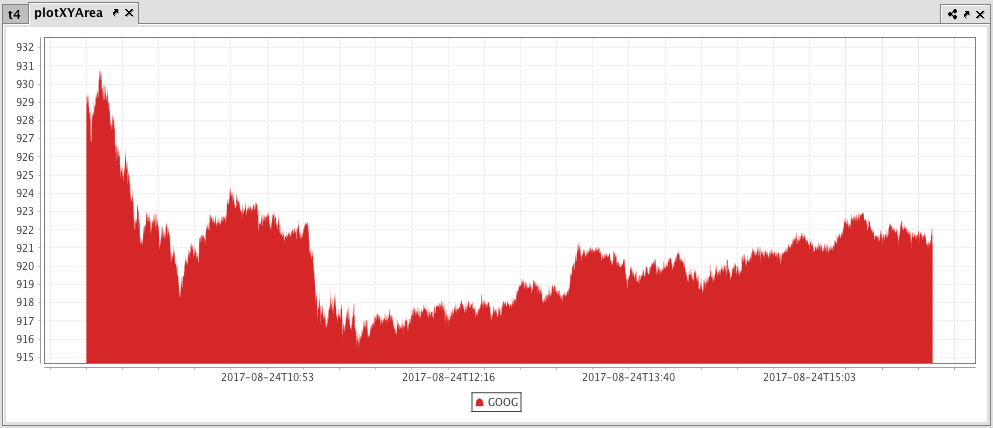
Plot XY Series as an Area Plot
from deephaven import *

# source the data
t4 = db.t("LearnDeephaven", "StockTrades").where("Date=`2017-08-24`", "USym=`GOOG`")

# plot the data
plotXYArea = plt.plot("GOOG", t4.where("USym = `GOOG`"), "Timestamp", "Last")\
    .xBusinessTime()\
    .plotStyle("Area")\
    .show()
# source the data
t4 = db.t("LearnDeephaven", "StockTrades").where("Date=`2017-08-24`", "USym=`GOOG`")

# plot the data
plotXYArea = plot("GOOG", t4.where("USym = `GOOG`"), "Timestamp", "Last")
    .xBusinessTime()
    .plotStyle("Area")
    .show()
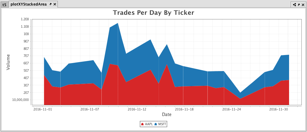
Plot Multiple XY Series as an Stacked Area Plot
from deephaven import *

t5 = db.t("LearnDeephaven", "EODTrades")\
    .where("ImportDate = `2017-11-01`", "Ticker in `AAPL`, `MSFT`")\
    .update("DateString = EODTimestamp.toDateString(TZ_NY)")\
    .where("inRange(DateString, `2016-11-01`, `2016-12-01`)")

plotXYStackedArea = plt.plot("AAPL", t5.where("Ticker = `AAPL`"), "EODTimestamp", "Volume")\
    .plot("MSFT", t5.where("Ticker = `MSFT`"), "EODTimestamp", "Volume")\
    .chartTitle("Trades Per Day By Ticker")\
    .xLabel("Date")\
    .yLabel("Volume")\
    .plotStyle("stacked_area")\
    .show()
t5 = db.t("LearnDeephaven", "EODTrades")
    .where("ImportDate = `2017-11-01`", "Ticker in `AAPL`, `MSFT`")
    .update("DateString = EODTimestamp.toDateString(TZ_NY)")
    .where("inRange(DateString, `2016-11-01`, `2016-12-01`)")

plotXYStackedArea = plot("AAPL", t5.where("Ticker = `AAPL`"), "EODTimestamp", "Volume")
    .plot("MSFT", t5.where("Ticker = `MSFT`"), "EODTimestamp", "Volume")
    .chartTitle("Trades Per Day By Ticker")
    .xLabel("Date")
    .yLabel("Volume")
    .plotStyle("stacked_area")
    .show()
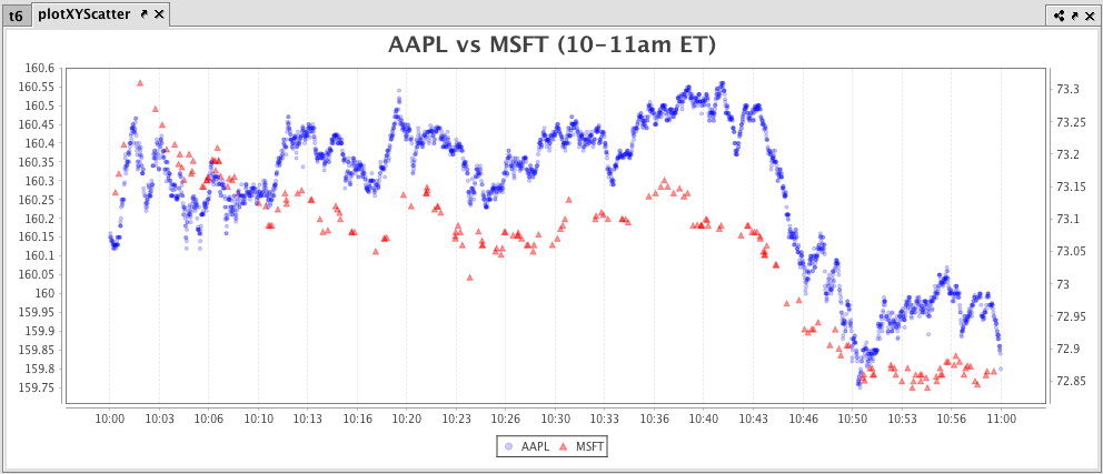
Plot Multiple XY Series as a Scatter Plot
from deephaven import *

t6 = db.t("LearnDeephaven", "StockTrades")\
    .where("Date = `2017-08-25`", "USym in `AAPL`, `GOOG`, `MSFT`")\
    .update("TimeBin = lowerBin(Timestamp, SECOND)")\
    .firstBy("TimeBin")\
    .where("TimeBin > '2017-08-25T10:00 NY' && TimeBin < '2017-08-25T11:00 NY'")

plotXYScatter = plt.plot("AAPL", t6.where("USym = `AAPL`"), "Timestamp", "Last")\
    .plotStyle("scatter")\
    .pointSize(0.5)\
    .pointColor(plt.colorRGB(0,0,255,50))\
    .pointShape("circle")\
    .twinX()\
    .plot("MSFT", t6.where("USym = `MSFT`"), "Timestamp", "Last")\
    .plotStyle("scatter")\
    .pointSize(0.8)\
    .pointColor(plt.colorRGB(255,0,0,100))\
    .pointShape("up_triangle")\
    .chartTitle("AAPL vs MSFT (10-11am ET)")\
    .show()
t6 = db.t("LearnDeephaven", "StockTrades")
    .where("Date = `2017-08-25`", "USym in `AAPL`, `GOOG`, `MSFT`")
    .update("TimeBin = lowerBin(Timestamp, SECOND)")
    .firstBy("TimeBin")
    .where("TimeBin > '2017-08-25T10:00 NY' && TimeBin < '2017-08-25T11:00 NY'")

plotXYScatter = plot("AAPL", t6.where("USym = `AAPL`"), "Timestamp", "Last")
    .plotStyle("scatter")
    .pointSize(0.5)
    .pointColor(colorRGB(0,0,255,50))
    .pointShape("circle")
    .twinX()
    .plot("MSFT", t6.where("USym = `MSFT`"), "Timestamp", "Last")
    .plotStyle("scatter")
    .pointSize(0.8)
    .pointColor(colorRGB(255,0,0,100))
    .pointShape("up_triangle")
    .chartTitle("AAPL vs MSFT (10-11am ET)")
    .show()
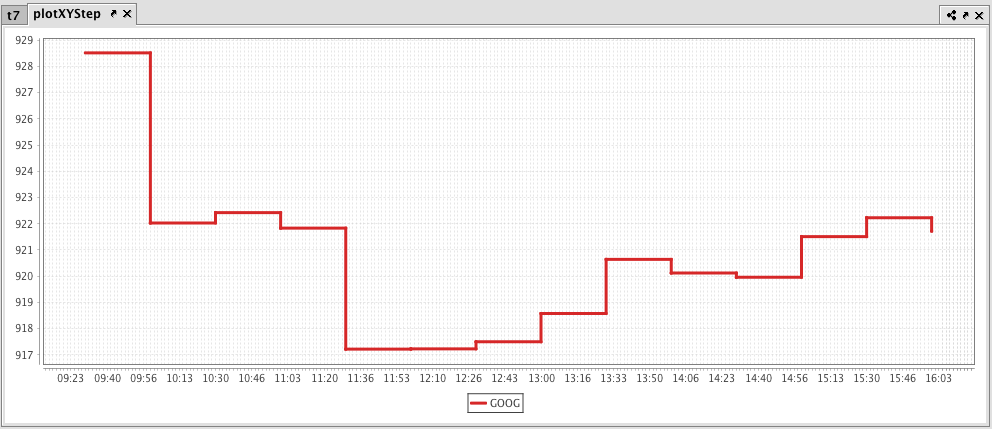
Plot XY Series as a Step Plot
from deephaven import *

t7 = db.t("LearnDeephaven","StockTrades")\
    .where("Date=`2017-08-24`","USym=`GOOG`")\
    .updateView("TimeBin=upperBin(Timestamp, 30 * MINUTE)")\
    .where("isBusinessTime(TimeBin)")

plotXYStep = plt.plot("GOOG", t7.where("USym = `GOOG`")\
    .lastBy("TimeBin"), "TimeBin", "Last")\
    .plotStyle("Step")\
    .lineStyle(plt.lineStyle(3))\
    .show()
t7 = db.t("LearnDeephaven","StockTrades")
    .where("Date=`2017-08-24`","USym=`GOOG`")
    .updateView("TimeBin=upperBin(Timestamp, 30 * MINUTE)")
    .where("isBusinessTime(TimeBin)")

plotXYStep = plot("GOOG", t7.where("USym = `GOOG`")
    .lastBy("TimeBin"), "TimeBin", "Last")
    .plotStyle("Step")
    .lineStyle(lineStyle(3))
    .show()
XY Series Plotting with Error Bars
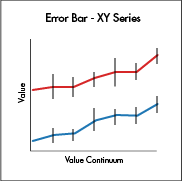 XY series plots can also be created with error bars. However, this is accomplished using a different plotting method. Details about plotting with error bars can be found at Plotting with Error Bars.
Additional Options for XY Series Plotting
For additional formatting options for XY series plotting, see:
Last Updated: 28 February 2020 12:20 -05:00 UTC Deephaven v.1.20200121 (See other versions)
Deephaven Documentation Copyright 2016-2020 Deephaven Data Labs, LLC All Rights Reserved