Visual Formatting
Almost any aspect of a chart or figure can be visually formatted to suit your needs. Visual formatting starts with themes, which provide a predetermined set of fonts, colors and other formatting styles you can use with any available chart type. Even though a theme is always in use, individual aspects of the chart formatting can be customized, including the following:
- Fonts used for titles or labels, including the font face, style, size, etc.
- Lines, including line styles (single, double, etc.), line thickness, dash patterns, and start/end/join styles.
- Point markers, including visibility and shapes.
- The color of lines, shapes, points, axis, gridlines, etc. Heatmaps are also available.
Themes
A theme can be viewed as a predetermined set of fonts, colors and other formatting you can use with any available chart type. Themes are applied at the figure level in Deephaven.
Deephaven comes with three core themes, which are named for the background brightness in each: Light, Medium and Dark. There are four additional themes (Pastel, Forte, Neon and BlackLight) available for further color variations.
To see the color variations used in all seven themes, download the Theme Color Palettes PDF file.
You can also build and save your own themes. Even with the use of themes, each chart component is fully customizable. See: Creating Custom Themes to learn more.
Light is the default theme. However, you can change the default theme used in your console by clicking Settings at the top of the Deephaven console. (See: Settings) You can also set the default value by running the following in the Deephaven console:
Plot.theme.default = <themeName>
To specify the theme to be used for a figure without changing the default settings, you can apply the theme method to the figure object. For example, the following code instructs Deephaven to change the default theme for this figure (and only this figure) to Dark:
figure().theme("Dark")
Creating Custom Themes
In addition to the preinstalled themes in Deephaven, you can also create your own custom themes to apply to your figures.
Themes are stored in files that use XML formatting to specify the characteristics of various elements in a chart. The root element of the XML file is <Theme>, and there are three required children elements.
<Name>is the name of the theme<Text>provides the formatting of various text elements<PlotElements>provides information about the formatting of plotting elements
Name
In the following example, Sample is the name of the theme.
<Name>Sample</Name>
Text
There are seven <Text> elements that can be assigned:
FigureTextFont- This is the default text element for the theme. IfFigureTextFontis not configured, all of the other six text elements must be configured. If any of the other six text elements is not configured,FigureTextFontwill be used.FigureTitleFont- Sets the font used for the Figure titleChartTitleFont- Sets the font used for the Chart title.AxisTitleFont- Sets the font used for the Axis titles.TickValuesFont- Sets the font used for the Axis tick labels.LegendFont- Sets the font used for the Legend text.PointLabelFont- Sets the font used for the Point Labels.
Each text element has the following four components: Name, Style, Size and Color. The syntax used to format the components is shown in the sample below. All four components must be set or the element will be ignored.
<FigureTextFont>
<Name>SanSerif</Name> <Style>PLAIN</Style>
<Size>14</Size> <Color r="65" g="65" b="65"/>
</FigureTextFont>
PlotElements
PlotElements describe the colors used for the following four components used in a plot:
Background- Color of the chart backgroundGrid- Color of the grid shown in front of the the backgroundAxis- Color of the lines that form the axisSeries- Collection of colors used to plot the data
Each of the first three elements are defined with only one color, which is specified using RGB notation. For example,
<Background>
<Color r="216" g="216" b="216"/>
</Background>
<Grid>
<Color r="175" g="175" b="175"/>
</Grid>
<Axis>
<Color r="65" g="65" b="65"/>
</Axis>
The Series element is defined using the following three methods:
ColorPaletteAlgo- Deephaven includes two color palettes that are determined by algorithms. Options include:TRIAD_MIXINGGOLDEN
ColorPaletteArray- Deephaven includes two color palettes that are defined in arrays. Options include:JAVAFXMATLABMATPLOTLIB
- A list of color elements defined by their respective RGB properties
The following examples show how to specify each of the color palettes used in a theme:
<Series>
<ColorPaletteAlgo>golden</ColorPaletteAlgo>
</Series>
<Series>
<ColorPaletteArray>matplotlib</ColorPaletteArray>
</Series>
<Series>
<Color r="216" g="216" b="216"/>
<Color r="175" g="175" b="175"/>
<Color r="65" g="65" b="65"/>
</Series>
Saving Your Custom Themes
Once a theme is created, it needs to be saved with its respective name followed by the suffix .theme. For example, sample.theme.
Theme names are case insensitive. Therefore you should be careful when saving new themes to ensure you don't overwrite existing themes.
To see an example of a completed custom plotting theme, see below.
Installing a New Custom Plotting Theme
Once you create a new custom plotting theme, you will need to ask your system administrator to load the XML file(s) to the server(s) where Deephaven is installed for your enterprise. Instructions for the system administrator are included in the Installing Custom Calendars and Custom Plotting Themes.
Example of a Custom Plotting Theme
<Theme>
<Name>Sample</Name>
<Text>
<FigureTextFont>
<Name>Arial</Name>
<Style>PLAIN</Style>
<Size>11</Size>
<Color r="32" g="32" b="32"/>
</FigureTextFont>
<FigureTitleFont>
<Name>Arial</Name>
<Style>BOLD</Style>
<Size>16</Size>
<Color r="0" g="25" b="51"/>
</FigureTitleFont>
<ChartTitleFont>
<Name>Arial</Name>
<Style>BI</Style>
<Size>14</Size>
<Color r="0" g="51" b="102"/>
</ChartTitleFont>
<AxisTitleFont>
<Name>Arial</Name>
<Style>PLAIN</Style>
<Size>11</Size>
<Color r="32" g="32" b="32"/>
</AxisTitleFont>
<TickValuesFont>
<Name>Arial</Name>
<Style>PLAIN</Style>
<Size>9</Size>
<Color r="96" g="96" b="96"/>
</TickValuesFont>
<LegendFont>
<Name>Arial</Name>
<Style>PLAIN</Style>
<Size>8</Size>
<Color r="32" g="32" b="32"/>
</LegendFont>
<PointLabelFont>
<Name>Arial</Name>
<Style>PLAIN</Style>
<Size>9</Size>
<Color r="64" g="64" b="64"/>
</PointLabelFont>
</Text>
<PlotElements>
<Background>
<Color r="216" g="216" b="216"/>
</Background>
<Grid>
<Color r="153" g="204" b="255"/>
</Grid>
<Axis>
<Color r="65" g="65" b="65"/>
</Axis>
<Series>
<Color r="0" g="102" b="204"/>
<Color r="204" g="102" b="0"/>
<Color r="0" g="204" b="102"/>
<Color r="204" g="0" b="0"/>
<Color r="0" g="204" b="204"/>
<Color r="204" g="204" b="0"/>
<Color r="204" g="0" b="204"/>
<Color r="102" g="204" b="0"/>
<Color r="255" g="0" b="127"/>
</Series>
</PlotElements>
</Theme>
Font Formatting
There are three font attributes you can use in plotting:
- Font Family
- Style
- Size
Font Family
Font family represents the names of the fonts used in your system such as Arial, Courier, Times New Roman, Verdana, etc. The default font family is Arial. If Arial is not available, the next available sans serif font (as specified in Java) will be used. To find the font families available on your system, click Settings at the top of the Deephaven interface and then select Font Chooser.
Font Style
There are four options for different font styles. The default font style is Plain.
|
Font Style |
Nomenclature (case insensitive) |
|---|---|
|
Plain |
|
|
Bold |
|
|
Italic |
|
|
Bold Italic |
|
Font Size
The font size is specified using an integer value. The default font size depends on the location in which the font is used. See table below.
|
Font Use |
Default Style |
Default Size |
|---|---|---|
|
Figure Title |
Bold |
28 |
|
Chart Title |
Bold |
20 |
|
Axis Titles |
Plain |
14 |
|
Tick Values |
Plain |
10 |
|
Point Labels |
Plain |
10 |
|
Legend |
Plain |
10 |
To change the font family, style and/or size for a given chart component, you need to apply the appropriate font method to that component, and then insert the appropriate values for each attribute into the argument. See examples below:
figureTitle("My Figure").figureTitleFont("Arial Black", "p", 32)
/* Changes the font used for the title of a figure to Arial Black, plain, and size 32pt */
chartTitle("My Chart").chartTitleFont("Arial", "Bold", 24)
/* Changes the font used for a chart title to Arial, Bold, and size 24pt */
xLabel("Time").xLabelFont("SansSerif", "P", 10)
/* Changes the font used for the label on X axis of a chart to SansSerif, plain, and size 10pt. */
legendFont("Tahoma", "BI", 9).legendColor("Purple")
/* Changes the font used for chart legend to Tahoma, bold italic, and size 9pt; and changes the color of the font to purple. */
Line Formatting
Syntax
lineStyle(lineStyle(...))
The lineStyle method must be called on the plot object. For example,
plot("SeriesName", source, "xCol", "yCol").lineStyle(lineStyle(20))
In addition to its color, there are four available aspects for formatting a line in Deephaven, and each can be adjusted by inserting arguments to the lineStyle method.
Line Width
The line width represents the line's thickness. The default value is 1. The line width can be changed by inserting a numeric primitive (i.e., int, long, float, double) into the argument for the lineStyle method. For example, the following will increase the line width to 8:
lineStyle(lineStyle(8))
End Style and Join Style
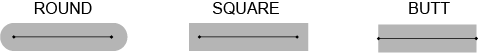
The end style of a line refers to the shape at either end of a line. There are three options: ROUND, SQUARE and BUTT. Both ends of the line have the same style. Examples of each are shown below.
The join style of a line refers to the type of intersection made when two lines meet each other. There are three options: ROUND, MITER, and BEVEL. Examples of each are shown below.
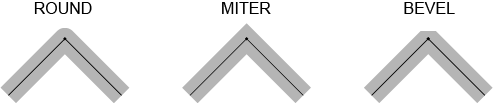
The default for both the end style and the join style is ROUND. To assign a different join style or end style to a line, you must assign values to each. For example, you cannot assign a specific end style without also assigning a specific join style.
To specify the end and join styles for a given line, you add the pair of string values into the argument for the lineStyle method as shown below:
lineStyle(lineStyle(String endStyle, String joinStyle))
For example, the following line will create a line with an end style of ROUND and a join style of MITER:
lineStyle(lineStyle("ROUND", "MITER"))
Dash Pattern
A dashed line can be used to provide distinctions between different lines in a chart. The pattern used for dashed lines is based on the length of the dash followed by the length of the gap after the dash. These dash/gap patterns are specified by the values presented in an array, which is then used as an argument to the lineStyle method. For example, the array [30,10] will create a pattern with a dash length of 30 and a gap length of 10, followed by another dash length of 30 and a gap length of 10. The resulting line would look similar to the following, with a dash length that is three times longer than the gap:

If only one value is included in the array, the dash and the gap after the dash will be the same. If more than one value is used in the array, the first value of the array represents the length of the first dash in the line. The next value in the array represents the length of the gap between it and the next dash. Additional values can be added into the array for subsequent dash/gap combinations. For example, the array [20,5] would create a dash pattern with a 20 to 5 gap ratio, which is then repeated for the rest of the line's length. Numeric primitives (i.e., int, long, float, double) can be used in the array to specify the sequential and repeating dash/space pattern to use.
The default dash pattern is no dashes (null).
To create a dashed line, the dash pattern value array needs to be placed into the argument for the lineStyle method. See examples and their respective line pattern samples below:
|
|
|
|
|
|
|
|
|


Important: The following three aspects of using dash patterns are important to keep in mind:
- The unit of measure used in dash patterns is dependent upon your system. If you assign a dash pattern to a line and it does not appear in the console as you might anticipate, try increasing the values in the array.
- The dash pattern is applied between data points within the series – not over entire series. Therefore, the dash pattern restarts at each subsequent data point.
- When plotting using a function, there are no specific data points being plotted. Rather the data is plotted over a mathematical continuum. Because dash patterns are plotted between data points, they will not appear on line plots that are based on functions.
Combining Multiple Line Style Attributes
You can assign any one of the lineStyle attributes individually. For example, you can assign only the line width, only the end style/join style, or only the dash pattern. You can also assign a combination of line width and the dash pattern. Finally, you can assign all three attributes at the same time. However, you cannot currently assign the end style/join style attributes with any other single attribute.
To assign multiple attributes, their respective arguments must be in the correct order. Available options follow, including the order required for each of the arguments:
lineStyle(lineStyle(width))
lineStyle(lineStyle("endStyle","joinStyle"))
lineStyle(lineStyle([dashPattern]))
lineStyle(lineStyle(width,[dashPattern]))
lineStyle(lineStyle(width,"endStyle","joinStyle",[dashPattern]))
Examples follow:
| Syntax |
Features |
|---|---|
|
|
width: 4 endStyle: default dash pattern: default |
|
|
width: default endStyle: default dash pattern: 10/3 |
|
|
width: 5 endStyle: default dash pattern: 40/5 |
|
|
width: 10 endStyle: ROUND dash pattern: 20/10 |
Point Formatting
The "point" is a specifically shaped symbol used in a line chart to notate an exact point of data. In Deephaven, there are 10 different shapes used for points, which are shown in the table below. (Note: The colors used in the table are for example only. )
|
Point Shape |
Shape Name |
|---|---|

|
SQUARE |

|
CIRCLE |

|
UP_TRIANGLE |

|
DIAMOND |

|
HORIZONTAL_RECTANGLE |

|
DOWN_TRIANGLE |

|
ELLIPSE |

|
RIGHT_TRIANGLE |

|
VERTICAL_RECTANGLE |

|
LEFT_TRIANGLE |
Deephaven automatically selects the point shapes in the order shown above. However, you can designate point shapes by using the pointShape() method in your query. (Note: the pointShape() method can only be used in 2D plotting.)
pointShape() and pointVisible()
The pointShape() method can be applied to XY Series plots and Category plots. When applying the pointShape() method to XY Series plots, the pointsVisible() method must also be used and set to true.
Note: The pointsVisible() method is not required when using a plot styles [e.g., plotStyle("scatter")]. However, the pointShape() method may still be used to override the default shape.
Examples of the syntax follow:
XY Series (default)
plot(...)
.pointShape("right_triangle")
.pointVisibile(true)
.show()
XY Series - Scatter Plot
plot(...)
.plotStyle("scatter")
.pointShape("ellipse")
.show()
Category Plot
catPlot(...)
.pointShape("diamond")
.show()
In the examples above, the name of the shape is used as a string in the argument for the pointShape() method, so the name of the shape needs to be enclosed in quotes. The string value for shape name can be uppercase, lowercase or mixed case. However, when using the more strict Java implementation method, the shape name needs to remain in uppercase.
For example, the following two queries will produce the same plot:
from deephaven import *

t = ttools.emptyTable(100).updateView("X=i", "Y = Math.random()")
p = plt.plot("PointShape example", t, "X", "Y")\
    .pointShape("up_triangle").pointsVisible(True)\
    .show()
t = emptyTable(100).updateView("X=i", "Y = Math.random()")
p = plot("PointShape example", t, "X", "Y")
        .pointShape("up_triangle").pointsVisible(true)
        .show()
#TODO NamedShape
from deephaven import *

importjava("com.illumon.iris.gui.shape.NamedShape")
t = ttools.emptyTable(100).updateView("X=i", "Y = Math.random()")
p = plt.plot("PointShape example", t, "X", "Y") \
    .pointShape(NamedShape.UP_TRIANGLE) \
    .pointsVisible(True) \
    .show()
import com.illumon.iris.gui.shape.NamedShape
t = emptyTable(100).updateView("X=i", "Y = Math.random()")
p = plot("PointShape example", t, "X", "Y")
        .pointShape(NamedShape.UP_TRIANGLE)
        .pointsVisible(true)
        .show()
The pointShape() method can also be used in conjunction with the plotBy group of methods, where multiple series are plotted in the same chart. (see Plotting Multiple Series in a Chart.)
An example of a plotBy query that also uses the pointShape() method follows:
from deephaven import *

tickers = convertToJavaHashSet(['A', 'AA'])
t2 = db.t("LearnDeephaven", "EODTrades").where("ImportDate = `2017-11-01`").where("Ticker in tickers")
p = plt.plotBy("High", t2, "EODTimestamp", "High", ["Ticker"])\
    .pointShape("up_triangle", ["A"])\
    .pointShape("down_triangle", ["AA"])\
    .pointsVisible(True)\
    .show()
tickers = ['A', 'AA'] as String[]
t2 = db.t("LearnDeephaven", "EODTrades").where("ImportDate = `2017-11-01`").where("Ticker in tickers")
p = plotBy("High", t2, "EODTimestamp", "High", ["Ticker"] as String[]).pointShape("up_triangle", ["A"] as String[]).pointShape("down_triangle", ["AA"] as String[])
        .pointsVisible(true)
        .show()
pointSize
In addition to changing the shape of a point, the pointSize() method can be used to change the point's size. The value entered as an argument to the pointSize() method then increases (or decreases) the point size by that factor. For example, to double the default size of a point, you would use the following:
plot(...).pointSize(2)
To decrease the point size by half, you would use the following:
plot(...).pointSize(0.5)
The numeric values entered as the argument can be primitives of the types int, long or doubles.
Point size can also be assigned to individual points based on arrays or table columns, as shown below:
plot(...).pointSize([1,2,3] as int[])
plot(...).pointSize(t,"Size")
Note: Take care when using large point sizes in plotting as they can cause the console to become very slow.
You can also change the color of a point by using the pointColor() method, which is explained in the section Color Formatting.
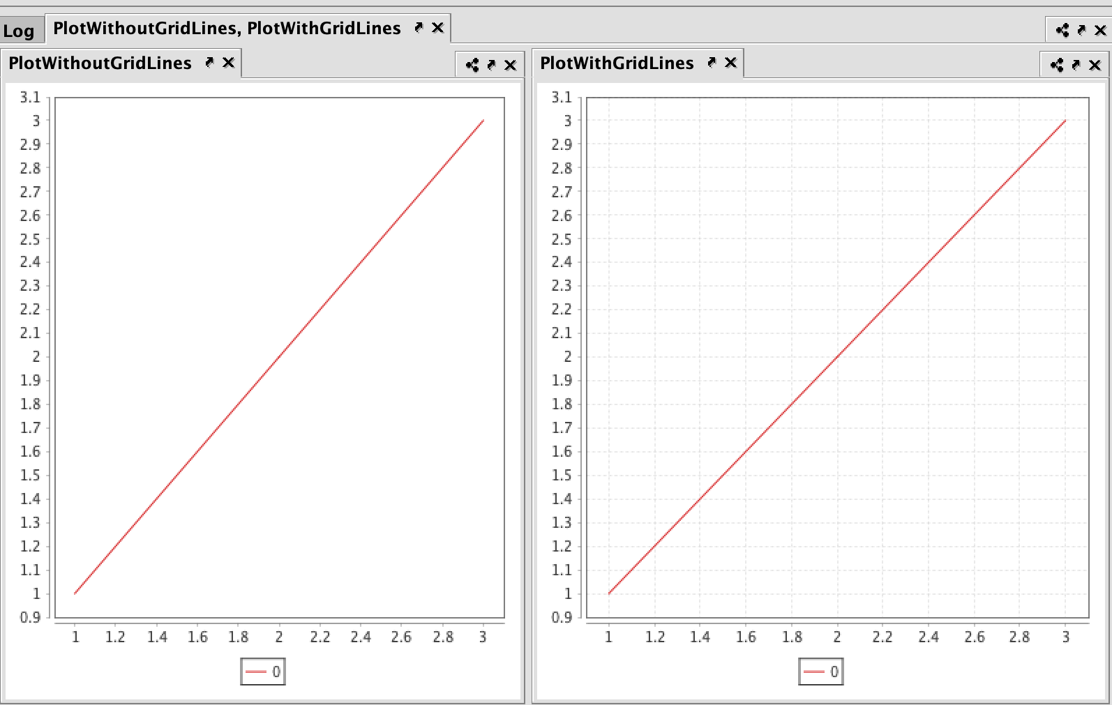
Grid Lines
The background grid used in a plot is visible by default. However, grid lines can be turned off (invisible) by using the gridLineVisible() method. Three variations are available.
Syntax
gridLineVisible(boolean)    // toggles all grid lines
xGridLinesVisible(boolean)  // toggles only the X axis gridlines
yGridLinesVisible(boolean)  // toggles only the Y axis gridlines
Example
from deephaven import *

PlotWithGridLines = plt.plot(0, [1,2,3], [1,2,3])
    .show()

PlotWithoutGridLines = plt.plot(0, [1,2,3], [1,2,3])
    .gridLinesVisible(False)
    .show()
PlotWithGridLines = plot(0, [1,2,3], [1,2,3])
    .show()
PlotWithoutGridLines = plot(0, [1,2,3], [1,2,3])
    .gridLinesVisible(false)
    .show()
Color Formatting
The default colors used in various plot components are initially determined by the theme being used. (See: Themes) However, many individual components can be assigned specific colors using the standard color methods in Deephaven. For more information about Deephaven Color methods, please refer to Assigning Colors in Deephaven.
The following methods can then be used to assign specific colors to individual plot components:
figureTitleColorchartTitleColorerrorBarColorlegendColorxColor //(this also changes the X axis label color)yColor //(this also changes the Y axis label color)axisColor //(this also changes the axis label color)seriesColorlineColorpointColor
Examples
figureTitleColor("SkyBlue")
chartTitleColor(colorRGB(159,159,159))
lineColor(colorHSL(0,0,204))
pointColor("#ff0000")
Last Updated: 25 February 2020 08:26 -05:00 UTC Deephaven v.1.20200121 (See other versions)
Deephaven Documentation Copyright 2016-2020 Deephaven Data Labs, LLC All Rights Reserved