Presenting Multiple Charts
There are two options for presenting multiple plots in the same Deephaven interface. You can nest them in the same workspace (see Nesting Tables and Plots), or you can add them to the same figure.
As described in the Charting Object Model, every chart in Deephaven is contained in a figure, and figures can hold multiple charts. Therefore, the first step in building a chart in Deephaven is to create a figure to hold the chart(s). The following is used to create a figure.
figure()
Deephaven assumes the figure will hold only one chart. When you need to create a figure to hold multiple charts, you will first need to define the grid for the number of rows and columns that will be needed to hold the charts you plan on creating. This is done by adding two arguments to the figure method to represent (1) the number of rows, and (2) the number of columns, in that order respectively.
figure(int rows, int columns)
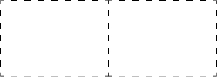
For example, you can show two charts in the same row with the following:
figure(1,2)
The underlying grid in the figure is not visible in the Deephaven interface. However, a representative layout would look like the following:
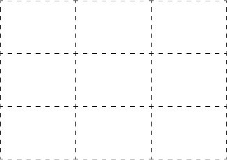
A figure with three columns and three rows (for a total of nine charts) would be represented by the following:
figure(3,3)
Now that you have the grid created, you need to instruct Deephaven which chart should be placed in each respective cell in the figure. This is done by specifying each chart's location when creating the chart.
Options for specifying the chart's location in the figure are shown in the table below:
| Description |
Sample Code and Layout |
|---|---|
|
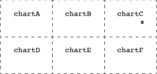
Simple Order (default) When no argument is assigned to the chart, the chart is positioned within the figure in the same order in which it was specified in the query. The first chart specified is placed in the first cell in the top left corner. The next chart is placed in the next cell to the right of the previous cell. This continues from left to right in each row, then top to bottom by row. |
|
|
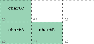
Numerical Cell Order This method enables you to assign a specific location for each chart, based on the index value of each cell. The index value of zero is used for the first position, so the next location to the right would be 1, then 2 and so on. Each cell is numbered from left to right in the same row, and then top to bottom by rows. The order in which the charts are presented in the query does not matter because each chart is assigned to a specific location. In the example to the right, |
|
|
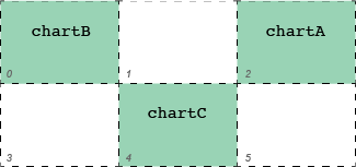
Coordinate-based Placement Coordinates can be used to specify the row and column (in that order respectively) for each location in the figure. The first number in the coordinate is the row number; the second is the column number. The index value of zero is used for the first position for each row and column respectively. The order in which the charts are presented in the query does not matter because each chart is assigned to a specific location. |
|
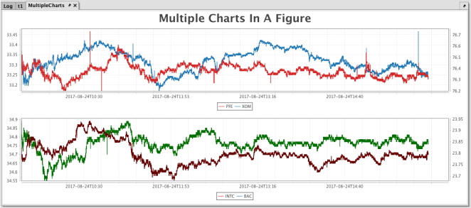
Example 1 - One Figure with Two Charts - Default Placement Order
In this example we are going to create one figure to hold two different plots. The location of each plot is not specified, so the default locations are used.
// source the data
t1 = db.t("LearnDeephaven","StockTrades").where("Date=`2017-08-24`","USym in `PFE`,`XOM`,`INTC`,`BAC`")
// create a figure with 2 rows and 1 column, and add a title to it
MultipleCharts = figure(2,1)
.figureTitle("Multiple Charts In A Figure")
// plot the first chart
.plot("PFE", t1.where("Sym=`PFE`"), "ExchangeTimestamp", "Last")
.twinX()
.plot("XOM", t1.where("Sym=`XOM`"), "ExchangeTimestamp", "Last")
.xBusinessTime()
// plot the second chart
.newChart()
.plot("INTC", t1.where("Sym=`INTC`"), "ExchangeTimestamp", "Last")
.lineColor(colorRGB(100,0,0))
.twinX()
.plot("BAC", t1.where("Sym=`BAC`"), "ExchangeTimestamp", "Last")
.lineColor(colorRGB(0,110,0))
.xBusinessTime()
.show()
The following figure containing two separate charts is created when the query is run. The plot showing PFE/XOM was listed first in the query and did not include any other placement instructions, so Deephaven placed it in the first position.
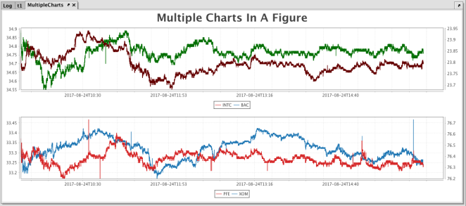
Example 2 - One Figure with Two Charts - Specified Placement
Like before, we are going to create one figure to hold two different plots. However, this time the location of each plot is specified using a numerical value for the newChart() method as highlighted below.
// source the data
t1 = db.t("LearnDeephaven","StockTrades").where("Date=`2017-08-24`","USym in `PFE`,`XOM`,`INTC`,`BAC`")
// create a figure with 2 rows and 1 column, and add a title to it
MultipleCharts = figure(2,1)
.figureTitle("Multiple Charts In A Figure")
// plot the first chart
.newChart(1)
.plot("PFE", t1.where("Sym=`PFE`"), "ExchangeTimestamp", "Last")
.twinX()
.plot("XOM", t1.where("Sym=`XOM`"), "ExchangeTimestamp", "Last")
.xBusinessTime()
// plot the second chart
.newChart(0)
.plot("INTC", t1.where("Sym=`INTC`"), "ExchangeTimestamp", "Last")
.lineColor(colorRGB(100,0,0))
.twinX()
.plot("BAC", t1.where("Sym=`BAC`"), "ExchangeTimestamp", "Last")
.lineColor(colorRGB(0,110,0))
.xBusinessTime()
.show()
The following figure containing two separate charts is created when the query is run. The PFE/XOM chart was listed first in the query, but it was assigned the second position through the use of newChart(1), so it occupies the second position in the figure. The INTC/BAC chart was assigned the first position through the use of newChart(0), so Deephaven placed it in the first position.
Placing a Chart that Spans Multiple Columns or Rows
You can instruct Deephaven to allow a chart to span multiple columns and/or multiple rows in a figure. This is done using the colSpan, rowSpan and span methods.
colSpan()
When you apply the colSpan method to a chart object, you are indicating that the chart should span multiple columns in the figure. This is similar to the "merge cells" function in most spreadsheet programs. The number of columns to span is specified as the argument to the colSpan method.
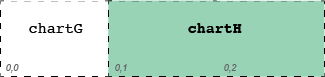
Example
colSpanExample1 = figure(1,3)
.newChart(0,0).chartTitle("chartG").plot(...)
.newChart(1,0).colSpan(2).chartTitle("chartH").plot(...)
The code above instructs Deephaven to do the following:
- Create a figure (
colSpanExample1) with one row and three columns - Place
chartGinto the cell with coordinates 0,0. - Place
chartHinto the cell with coordinates 0,1; and allow it to span two columns.
The resulting figure would look similar to the following.
Example
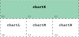
colSpanExample2 = figure(2,3)
.newChart(0,0).colSpan(3).chartTitle("chartK").plot(...)
.newChart(1,0).chartTitle("chartL").plot(...)
.newChart(1,1).chartTitle("chartM").plot(...)
.newChart(1,2).chartTitle("chartN").plot(...)
The code above instructs Deephaven to do the following:
- Create a figure (
colSpanExample) with two rows and three columns. - Place
chartKinto the first cell and allow it to span three columns. - Place
chartLinto the next cell with coordinates 1,0. - Place
chartMinto the next cell with coordinates 1,1. - Place
chartNinto the next cell with coordinates 1,2.
The resulting figure would look similar to the following.
rowSpan()
When you apply the rowSpan method to a chart object, you are indicating the chart should span multiple rows in the figure. This is similar to the "merge cells" function in many spreadsheet programs. The number of rows to span is specified as the argument to the rowSpan method.
Example
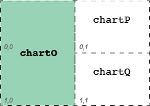
rowSpanExample = figure(2,2)
.newChart(0,0).rowSpan(2).chartTitle("chartO").plot(...)
.newChart(0,1).chartTitle("chartP").plot(...)
.newChart().chartTitle("chartQ").plot(...)
The code above instructs Deephaven to do the following:
- Create a figure (
rowSpanExample) with two rows and two columns. - Place
chartOinto the first cell, and allow it to span two rows. - Place
chartPinto the cell with coordinates 0,1. - Place
chartQinto the next available cell. (Note: if the coordinates are not specified for chart placement, the chart is placed into the next available cell in the grid.)
The resulting figure would look similar to the following.
span()
When you apply the span method to a chart object, you are indicating the chart should span multiple rows and multiple columns (in that order) in the figure. The number of rows and columns to span is specified as the argument to the span method. For example, span(3,2) tells Deephaven the chart should span three rows and two columns.
Example
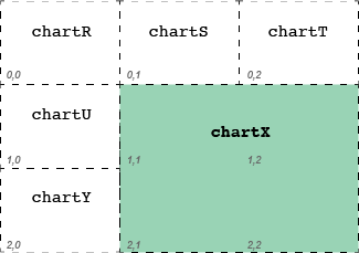
spanMulti = figure(3,3)
.newChart().chartTitle("chartR").plot(...)
.newChart().chartTitle("chartS").plot(...)
.newChart().chartTitle("chartT").plot(...)
.newChart().chartTitle("chartU").plot(...)
.newChart().span(2,2).chartTitle("chartX").plot(...)
.newChart().chartTitle("chartY").plot(...)
The code above instructs Deephaven to do the following:
- Create a figure (
spanMulti) with three columns and three rows - Place
chartRinto the cell with coordinates 0,0. - Place
chartSinto the cell with coordinates 0,1. - Place
chartTinto the cell with coordinates 0,2. - Place
chartUinto the cell with coordinates 1,0. - Place
chartXinto the cell with coordinates 1,1; allow it span two rows and two columns. - Place
chartYinto the cell with coordinates 2,0.
The resulting figure would look similar to the following:
Last Updated: 16 February 2021 18:07 -04:00 UTC Deephaven v.1.20200928 (See other versions)
Deephaven Documentation Copyright 2016-2020 Deephaven Data Labs, LLC All Rights Reserved