Plotting Overview
When working with data, especially big data, the ability to visualize relationships is paramount. One can stare at a table full of data all day without uncovering anything particularly interesting or useful. However, when data is converted into the proper graphic representation, trends, patterns and distinctions can become readily apparent. This is the art of data visualization.
Deephaven provides you with the tools you need to easily and completely visualize your data.
Charting Object Model
Charting in Deephaven is based on an object model with the primary components as shown below:
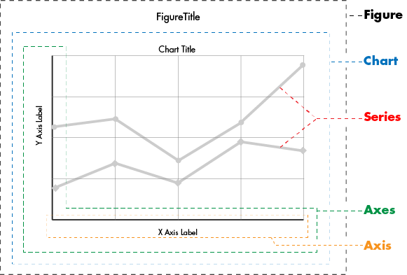
Figure
The figure is the container that holds the chart (or charts) in the Deephaven user interface. A figure cannot hold another figure, but a figure can hold multiple charts. Formatting themes are applied at the figure level.
Chart
The chart is the visual representation of the data being plotted. Charting types in Deephaven include:
- XY Series, including line, bar, scatter, area, and stacked area variations
- Category including bar, line, area, and stacked area variations
- Histogram
- Category Histogram
- Pie
- Open, High, Low and Close (OHLC)
- ErrorBar, including XY Series and Category variations
Axes
The axes represent the set of axis components in a chart. Data is plotted against the axes. Multiple axes may share a common axis (e.g., a common x-axis).
Axis
An axis can be either a continuous numerical value (e.g., 1-100) or a set of discrete categorical values (e.g., Amber, Darin, Jane, Paul, etc.)
Series
Simply speaking, a series is a set of data. All data plotted on a chart comes from the series objects. For example, one line on an XY Series Chart represents one data series.
Components within the Charting Object Model can be adjusted/manipulated as needed to suit your preferences. See: Formatting Chart Components for more information about available options.
Charting Quick Start
There are three basic steps to creating a chart in Deephaven.
The following example provides a quick demonstration of the three-step process.
Example 1
In this example, we are going to create a single series plot that shows the trend in the Ask price for a common security. The entire query follows:
from deephaven import Plot

t1 = db.t("LearnDeephaven","StockTrades") \
    .where("Date=`2017-08-24`", "USym=`PFE`")
plotPFE = Plot.plot("PFE", t1, "Timestamp", "Last").xBusinessTime().show()
t1=db.t("LearnDeephaven","StockTrades")
        .where("Date=`2017-08-24`", "USym=`PFE`")
plotPFE = plot("PFE", t1, "Timestamp", "Last").xBusinessTime().show()
The following illustration explains what each block of code is doing.

Running the query presents the following chart:

Additional charting examples follow.
Example 2 - Data Series with Multiple Y Axes
In this example we are going to plot the Last price for two common securities. There is a considerable price difference between values for PFE and XOM , so we are going to present a second Y axis on the right side of the chart to better distinguish the values and the respective trends.
from deephaven import Plot

# source the data
t1 = db.t("LearnDeephaven", "StockTrades").where("Date=`2017-08-24`", "USym in `PFE`,`XOM`")

# plot the data
PlotDualYAxis = Plot.plot("PFE", t1.where("USym = `PFE`"), "Timestamp", "Last")\
    .twinX()\
    .plot("XOM", t1.where("USym = `XOM`"), "Timestamp", "Last")\
    .xBusinessTime()\
    .show()
//source the data
t1 = db.t("LearnDeephaven","StockTrades").where("Date=`2017-08-24`","USym in `PFE`,`XOM`")

//plot the data
PlotDualYAxis = plot("PFE", t1.where("USym = `PFE`"), "Timestamp", "Last")
        .twinX()
        .plot("XOM", t1.where("USym = `XOM`"), "Timestamp", "Last")
        .xBusinessTime()
        .show()
When the code shown above is processed, the value scale for PFE is shown on the left Y axis, while the value scale for XOM is shown on the right.

Example 3 - Category Plot
In this example, we are going to create a category plot that shows year-over-year sales in March for the top five car manufacturers.
Note: the following assumes the data has already been sourced in a table named "sales".
SalesYoY = Plot.catPlot("March2017", sales, "Brand", "SoldMarch2017")
.catPlot("March2016", sales, "Brand", "SoldMarch2016")
.show()
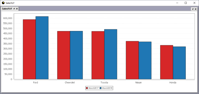
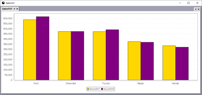
Colors are automatically selected for components of a chart. These colors are based on the theme selected. As shown in the chart above, the first two colors are red and blue. This is because the "Light" theme is being used. However, even though a theme applies the default colors, those colors can easily be changed. To do so, all we need to do is add the seriesColor method to each plot method as shown in the adjusted query below.
SalesYoY = catPlot("March2017", sales, "Brand", "SoldMarch2017")
.seriesColor("GOLD")
.catPlot("March2016", sales, "Brand", "SoldMarch2016")
.seriesColor("PURPLE")
.show()
When the code shown above is processed, the default color for the first category (RED) is replaced with GOLD, and the default color for the second category (BLUE) is replaced with PURPLE.
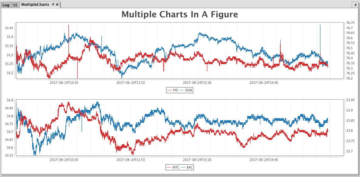
Example 4 - One Figure with Two Charts
In this example, we are going to create a figure to hold two different plots.
from deephaven import Plot

# source the data
t1 = db.t("LearnDeephaven", "StockTrades")\
    .where("Date=`2017-08-24`", "USym in `PFE`,`XOM`,`INTC`,`BAC`")

# create a figure with 2 rows and 1 column, and add a title to it
MultipleCharts = Plot.figure(2, 1)\
    .figureTitle("Multiple Charts In A Figure")\
    .plot("PFE", t1.where("USym=`PFE`"), "Timestamp", "Last")\
    .twinX()\
    .plot("XOM", t1.where("USym=`XOM`"), "Timestamp", "Last")\
    .xBusinessTime()\
    .newChart()\
    .plot("INTC", t1.where("USym=`INTC`"), "Timestamp", "Last")\
    .twinX()\
    .plot("BAC", t1.where("USym=`BAC`"), "Timestamp", "Last")\
    .xBusinessTime()\
    .show()
// source the data
t1 = db.t("LearnDeephaven","StockTrades")
        .where("Date=`2017-08-24`","USym in `PFE`,`XOM`,`INTC`,`BAC`")

// create a figure with 2 rows and 1 column, and add a title to it
MultipleCharts = figure(2,1)
        .figureTitle("Multiple Charts In A Figure")

// plot the first chart
        .plot("PFE", t1.where("USym=`PFE`"), "Timestamp", "Last")
        .twinX()
        .plot("XOM", t1.where("USym=`XOM`"), "Timestamp", "Last")
        .xBusinessTime()

// plot the second chart
        .newChart()
        .plot("INTC", t1.where("USym=`INTC`"), "Timestamp", "Last")
        .twinX()
        .plot("BAC", t1.where("USym=`BAC`"), "Timestamp", "Last")
        .xBusinessTime()
        .show()
Syntax
Deephaven offers two options for writing queries to charts.
- Verbose Syntax - This method is more granular, and allows the user to specify all aspects of the plot.
- Concise Syntax - This method is faster and easier to use because it attempts to understand the user's intention.
However, both options can be used together. For example, users can use the concise syntax to create the base chart, and then augment the query with verbose syntax to specify certain attributes.
Verbose Syntax
The verbose plotting syntax is typically used when creating plots that are more complex or when users want extreme control over generating the plot.
from deephaven import Plot

tAAPL = db.t("LearnDeephaven", "StockTrades")\
    .where("Date=`2017-08-21`", "USym=`AAPL`")
tGOOG = db.t("LearnDeephaven", "StockTrades")\
    .where("Date=`2017-08-21`", "USym=`GOOG`")

MyPlot=Plot.figure(1, 2)\
    .theme("Neon")\
    .figureTitle("MyPlot")\
    .figureTitleFont("Arial Black", "p", 32)\
    .newChart()\
    .chartTitle("Chart1")\
    .figureTitleFont("Arial", "p", 18)\
    .newAxes()\
    .plot("Series1", tAAPL, "Timestamp", "Last")\
    .lineStyle(Plot.lineStyle(10, "ROUND", "MITER", 20., 10.))\
    .lineColor(Plot.colorRGB(255, 0, 0, 100))\
    .newChart()\
    .newAxes()\
    .plot("Series2", tGOOG, "Timestamp", "Last")\
    .lineStyle(Plot.lineStyle(15, "ROUND", "MITER", 40., 5.))\
    .lineColor(Plot.colorRGB(255, 0, 0, 100))\
    .pointColor(Plot.colorHSL(210, 100, 80))\
    .show()
tAAPL = db.t("LearnDeephaven","StockTrades")
        .where("Date=`2017-08-21`","USym=`AAPL`")
tGOOG = db.t("LearnDeephaven","StockTrades")
        .where("Date=`2017-08-21`","USym=`GOOG`")

MyPlot=figure(1,2)
        .theme("Neon")
        .figureTitle("MyPlot")
        .figureTitleFont("Arial Black", "p", 32)
        .newChart()
        .chartTitle("Chart1")
        .figureTitleFont("Arial", "p", 18)
        .newAxes()
        .plot("Series1", tAAPL,"Timestamp","Ask")
        .lineStyle(lineStyle(10,"ROUND", "MITER", [20,10]))
        .lineColor(colorRGB(255,0,0,100))
        .newChart()
        .newAxes()
        .plot("Series2", tGOOG,"Timestamp","Ask")
        .lineStyle(lineStyle(15,"ROUND", "MITER", [40,5]))
        .lineColor(colorRGB(255,0,0,100))
        .pointColor(colorHSL(210,100,80))
        .show()
Note: In the previous examples, the plotting-related methods are placed on their own line for clarity. However, just like table methods, plotting methods can be chained together in sequence instead. For example, the following will work the same as the MyPlot query above:
from deephaven import Plot

MyPlot=Plot.figure(1,2).theme("Neon").figureTitle("MyPlot").figureTitleFont("Arial Black", "p", 32).newChart().chartTitle("Chart1").figureTitleFont("Arial", "p", 18).newAxes().plot("Series1",tAAPL, "Timestamp", "Last").lineStyle(Plot.lineStyle(10, "ROUND", "MITER", DoubleArray([20,10]))).lineColor(Plot.colorRGB(255,0,0,100)).newChart().newAxes().plot("Series2", tGOOG,"Timestamp","Last").lineStyle(Plot.lineStyle(15,"ROUND", "MITER", DoubleArray([40,5]))).lineColor(colorRGB(255,0,0,100)).pointColor(colorHSL(210,100,80)).show()
MyPlot=figure(1,2).theme("Neon").figureTitle("MyPlot").figureTitleFont("Arial Black", "p", 32).newChart().chartTitle("Chart1").figureTitleFont("Arial", "p", 18).newAxes().plot("Series1",tAAPL, "Timestamp", "Last").lineStyle(lineStyle(10, "ROUND", "MITER", [20,10])).lineColor(colorRGB(255,0,0,100)).newChart().newAxes().plot("Series2", tGOOG,"Timestamp","Last").lineStyle(lineStyle(15,"ROUND", "MITER", [40,5])).lineColor(colorRGB(255,0,0,100)).pointColor(colorHSL(210,100,80)).show()
Concise Syntax
The concise syntax attempts to figure out what the user is trying to do so that less typing is required. Under the covers, the latest figure, chart and axes are systematically tracked and then created/adjusted if necessary. This allows the most recently created function calls to be directed to these objects.
For example, the following "concise" query produces the same core charts as the example used earlier. Less details are specified in this query, but results are provided much faster with much less coding.
from deephaven import Plot

tAAPL = db.t("LearnDeephaven", "StockTrades")\
    .where("Date=`2017-08-21`", "USym=`AAPL`")

tGOOG = db.t("LearnDeephaven", "StockTrades")\
    .where("Date=`2017-08-21`", "USym=`GOOG`")

MyPlot = Plot.figure(1,2)\
    .plot("Series1", tAAPL, "Timestamp", "Last")\
    .newChart()\
    .plot("Series2", tGOOG, "Timestamp", "Last")\
    .show()
tAAPL = db.t("LearnDeephaven","StockTrades")
        .where("Date=`2017-08-21`","USym=`AAPL`")
tGOOG = db.t("LearnDeephaven","StockTrades")
        .where("Date=`2017-08-21`","USym=`GOOG`")

MyPlot=figure(1,2)
        .plot("Series1",tAAPL,"Timestamp","Last")
        .newChart()
        .plot("Series2",tGOOG,"Timestamp","Last")
        .show()
See also: Deephaven Plotting Cheat Sheet (pdf)
Last Updated: 16 February 2021 18:07 -04:00 UTC Deephaven v.1.20200928 (See other versions)
Deephaven Documentation Copyright 2016-2020 Deephaven Data Labs, LLC All Rights Reserved