Histogram Plots
 The histogram is used to show how frequently different data values occur. The data is divided into logical intervals (or bins) , which are then aggregated and charted with vertical bars. Unlike bar charts (category plots), bars in histograms do not have spaces between them unless there is a gap in the data.
Data Sourcing
Histograms can be plotted using data from tables or arrays.
Creating a Histogram Plot using Data from a Table
When data is sourced from a table, the following syntax can be used:
histPlot("seriesName", source, "ValueCol", nbins)
histPlotis the method used to create a histogram."SeriesName"is the name (as a string) you want to use to identify the series on the chart itself.sourceis the table that holds the data you want to plot."ValueCol"is the name of the column (as a string) of data to be used for the X values.nbinsis the number of intervals to use in the chart.
When data is sourced from an array, the following syntax can be used:
histPlot("SeriesName", [x], nbins)
histPlotis the method used to create a histogram."SeriesName"is the name (as a string) you want to use to identify the series on the chart itself.[x]is the array containing the data to be used for the X values.nbinsis the number of intervals to use in the chart.
The histPlot method assumes you want to plot the entire range of values in the dataset. However, you can also set the minimum and maximum values of the range using rangeMin and rangeMax respectively.
The following example shows the syntax using a table as the datasource:
histPlot("seriesName", source, "ValueCol", rangeMin, rangeMax, nbins)
histPlotis the method used to create a histogram."SeriesName"is the name (as a string) you want to use to identify the series on the chart itself.sourceis the table that holds the data you want to plot."ValueCol"is the name of the column (as a string) of data to be used for the X values.rangeMinis the minimum value (as a double) of the range to be included.rangeMaxis the maximum value (as a double) of the range to be included.nbinsis the number of intervals to use in the chart.
The following example shows the syntax using an array as the datasource:
histPlot("SeriesName", [x], rangeMin, rangeMax, nbins)
histPlotis the method used to create a histogram."SeriesName"is the name (as a string) you want to use to identify the series on the chart itself.[x]is the array containing the data to be used for the X values.rangeMinis the minimum value (as a double) of the range to be included.rangeMaxis the maximum value (as a double) of the range to be included.nbinsis the number of the intervals to use in the chart.
Example
from deephaven import Plot
tHist = db.t("LearnDeephaven", "StockTrades")\
.where("Date=`2017-08-25`")\
.view("Sym", "Last", "Size", "ExchangeTimestamp")
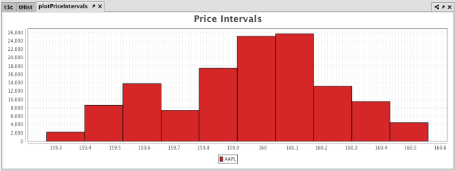
plotPriceIntervals = Plot.histPlot("AAPL", tHist.where("Sym=`AAPL`"), "Last", 10)\
.chartTitle("Price Intervals")\
.show()
tHist = db.t("LearnDeephaven", "StockTrades")
    .where("Date=`2017-08-25`")
    .view("Sym", "Last", "Size", "ExchangeTimestamp")

plotPriceIntervals = histPlot("AAPL", tHist.where("Sym=`AAPL`"), "Last", 10)
    .chartTitle("Price Intervals")
    .show()
The first part of the query, retrieves the data from the StockTrades table in the LearnDeephaven namespace, filters it and stores it to a variable named tHist.
The second part of the query, plots the histogram as follows:
plotPriceIntervalsis the name of the variable that will hold the chart.histPlotis the method.AAPLis the name of the series to use in the chart.trades.where("Sym=`AAPL`")is the table from which our data is being pulled, filtered to show data only when the value in theSymcolumn isAAPL.Lastis the name of the column in the table that contains the values we want to plot, and10is the number of intervals we want to use to divide up the sales.- And, finally, the
showmethod presents the chart in theplotPriceIntervalsvariable.
When Deephaven processes the query, the histogram is produced. There are 10 bars on the histogram, showing the Price Intervals into 10 value groups.
Creating a Histogram Plot using Data from an Array
When data is sourced from an array, the following syntax can be used:
histPlot("SeriesName", [Values])
histPlotis the method used to create a category histogram."SeriesName"is the name (as a string) you want to use to identify the series on the plot itself.[Values]is the array containing the discrete values.
Additional Formatting Options
For additional formatting options for histogram plots, please refer to:
Last Updated: 16 February 2021 18:07 -04:00 UTC Deephaven v.1.20200928 (See other versions)
Deephaven Documentation Copyright 2016-2020 Deephaven Data Labs, LLC All Rights Reserved