Category Histogram Plots
The category histogram plot is used to show how frequently a set of discrete values (categories) occur.
Data Sourcing
Category histograms can be plotted using data from tables or arrays.
Creating a Category Histogram Plot using Data from a Table
When data is sourced from a table, the following syntax can be used:
catHistPlot("seriesName", source, "ValueCol")
catHistPlotis the method used to create a category histogram."SeriesName"is the name (as a string) you want to use to identify the series on the chart itself.sourceis the table that holds the data you want to plot."ValueCol"is the name of the column (as a string) containing the discrete values.
Example
from deephaven import Plot
tHist = db.t("LearnDeephaven", "StockTrades")\
.where("Date=`2017-08-25`")\
.view("Sym", "Last", "Size", "ExchangeTimestamp")
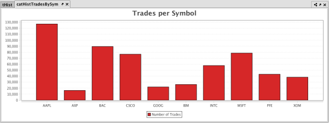
catHistTradesBySym = Plot.catHistPlot("Number of Trades", tHist, "Sym")\
.chartTitle("Trades per Symbol")\
.show()
tHist = db.t("LearnDeephaven", "StockTrades")
    .where("Date=`2017-08-25`")
    .view("Sym", "Last", "Size", "ExchangeTimestamp")

catHistTradesBySym = catHistPlot("Number of Trades", tHist, "Sym")
    .chartTitle("Trades per Symbol")
    .show()
The first part of the query, retrieves the data from the StockTrades table in the LearnDeephaven namespace.
The second part of the query, plots the histogram as follows:
catHistTradesBySymis the name of the variable that will hold the plot.catHistPlotis the method.Number of Tradesis the name of the series to use in the plot.tradesis the table from which our data is being pulled.Symis the name of the column in the table containing the discrete values.chartTitle("Trades per Symbol")adds a chart title to the plot- And, finally, the
showmethod presents the plot in thecatHistTradesBySymvariable.
When the code above is processed, the following category histogram is produced, which represents the number of trades for each symbol in the table.
Creating a Category Histogram Plot using Data from an Array
When data is sourced from an array, the following syntax can be used:
catHistPlot("SeriesName", [Values])
catHistPlotis the method used to create a category histogram."SeriesName"is the name (as a string) you want to use to identify the series on the plot itself.[Values]is the array containing the discrete values.
Additional Formatting Options
For additional formatting options for category histogram plots, please refer to:
Last Updated: 16 February 2021 18:07 -04:00 UTC Deephaven v.1.20200928 (See other versions)
Deephaven Documentation Copyright 2016-2020 Deephaven Data Labs, LLC All Rights Reserved