Creating Charts
The following six core types of charts are available in Deephaven:
XY Series (plot)
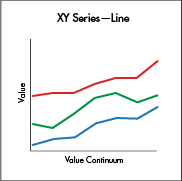
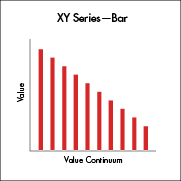

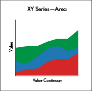
An XY Series Chart is generally used to show values over a continuum, such as time. XY Series can be represented as a line, a bar, an area or as a collection of points. The X axis is used to show the domain, while the Y axis shows the related values at specific points in the range.
Syntax
When data is sourced from a table, the following syntax can be used:
plot("SeriesName", source, "xCol", "yCol")
plotis the method used to create an XY Series Chart."SeriesName"is the name (as a string) you want to use to identify the series on the chart itself.sourceis the table that holds the data you want to plot"xCol"is the name of the column of data to be used for the X value"yCol"is the name of the column of data to be used for the Y value
When data is sourced from arrays, the following syntax can be used:
plot("SeriesName", [x], [y])
plotis the method used to create an XY Series Chart."SeriesName"is the name (as a string) you want to use to identify the series on the chart itself.[x]is the array containing the data to be used for the X value[y]is the array containing the data to be used for the Y value
When data is sourced from a function, the following syntax can be used:
plot("SeriesName", function)
plotis the method used to create an XY Series Chart."SeriesName"is the name (as a string) you want to use to identify the series on the chart itself.functionis a mathematical operation that maps one value to another. Examples of Groovy functions and their formatting follow:{x->x+100}adds 100 to the value of x{x->x*x}squares the value of x{x->1/x}uses the inverse of x{x->x*9/5+32}Fahrenheit to Celsius conversion
Note: If you are plotting a function in a chart by itself, you should consider applying a range for the function using the funcRange or xRange method. Otherwise, the default value ([0,1]) will be used, which may not meet your requirements. For example:
plot("Function", {x->x*x} ).funcRange(0,10)
If the function is being plotted with other data series, the funcRange method is not needed, and the range will be obtained from the other data series.
When using a function plot, you may also want to increase or decrease the granularity of the plot by declaring the number of points to include in the range. This is configurable using the funcNPoints method. For example:
plot("Function", {x->x*x} ).funcRange(0,10).funcNPoints(55)
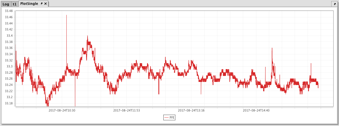
Example - XY Series
The example below will show the price of a single security (PFE) over time.
//source the data
t1 = db.t("LearnIris","StockTrades").where("Date=`2017-08-24`","USym=`PFE`")
//plot the data
PlotSingle = plot("PFE", t1.where("USym = `PFE`"), "Timestamp", "Last")
.xBusinessTime()
.show()
The first code block gathers the data for the chart, telling Deephaven to access the StockTrades table in the LearnIris namespace; and then filter it to include only the data for August 24, 2017, and only when the USym is PFE. That data is then saved to a new variable named t1.
The second code block tells Deephaven to create an XY series chart named PlotSingle. PFE is the series name; it uses data from the t1 table. Data from the Timestamp column should be used for the X value, and data from the Last column should be used as the Y value. The xBusinessTime method limits the data to actual business hours, and the .show method then tells Deephaven to present the chart in the Deephaven console.
The resulting chart is presented below.
XY Series with Shared Axes
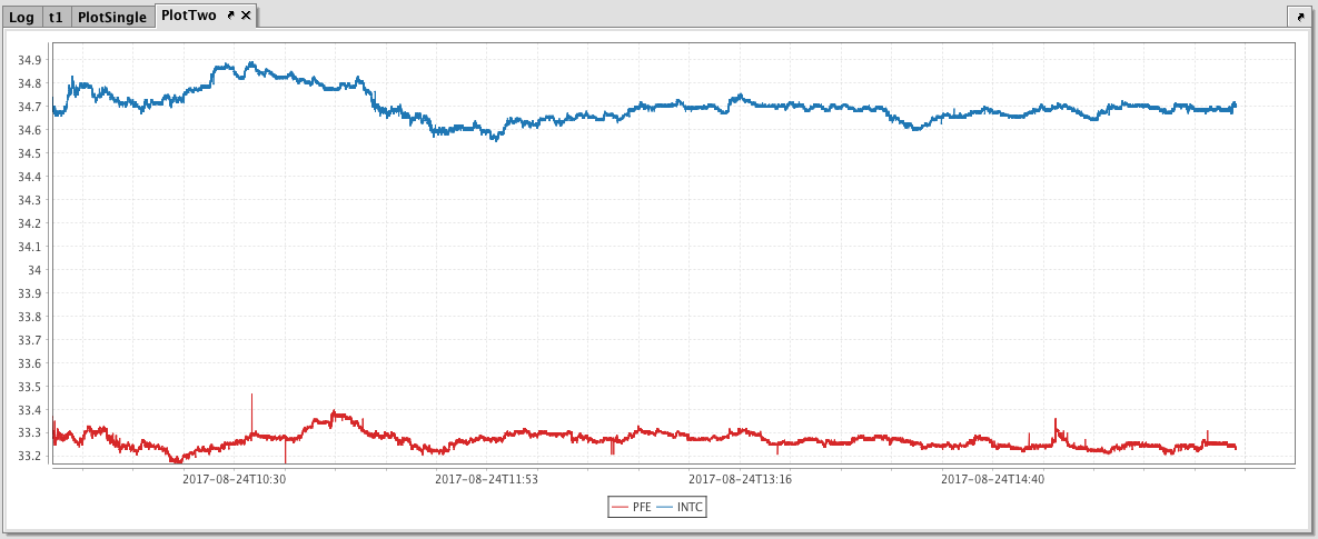
You can also compare multiple series over the same period of time by creating an XY Series Chart with shared axes. In the following example, a second series has been added to the previous example, thereby creating two line graphs on the same chart. The code to source and plot the second dataset is highlighted below:
//source the data
t1 = db.t("LearnIris","StockTrades")
.where("Date=`2017-08-24`","USym in `PFE`,`INTC`")
//plot the data
PlotTwo = plot("PFE", t1.where("USym = `PFE`"), "Timestamp", "Last")
.plot("INTC", t1.where("USym = `INTC`"), "Timestamp", "Last")
.xBusinessTime()
.show()
The resulting chart with two series is shown below.
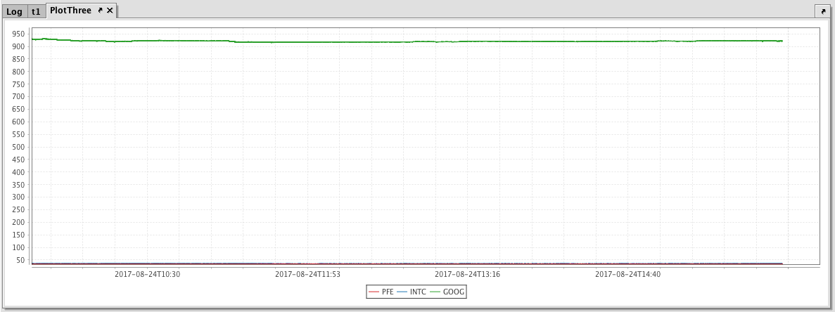
XY Series Chart - Multiple Y Axis
When plotting multiple series in a single chart, the range of the Y axis is an important factor to watch. In the previous example, both securities had values within in a relatively narrow range (33 to 35). Therefore, any change in values was easy to visualize. However, as the range of the Y axis increases, those changes become harder to visualize.
To show an example of this, we will add GOOG as the third security to the previous example.
//source the data
t1 = db.t("LearnIris","StockTrades").where("Date=`2017-08-24`","USym in `PFE`,`INTC`,`GOOG`")
//plot the data
PlotTwo = plot("PFE", t1.where("USym = `PFE`"), "Timestamp", "Last")
.plot("INTC", t1.where("USym = `INTC`"), "Timestamp", "Last")
.plot("GOOG", t1.where("USym = `GOOG`"), "Timestamp", "Last")
.xBusinessTime()
.show()
When we add GOOG, the scale of the Y axis now needs to cover a range from 33 to almost 1,000. As you can see in the chart below, using a range this large results in relatively flat lines with barely distinguishable differences in values or trend.
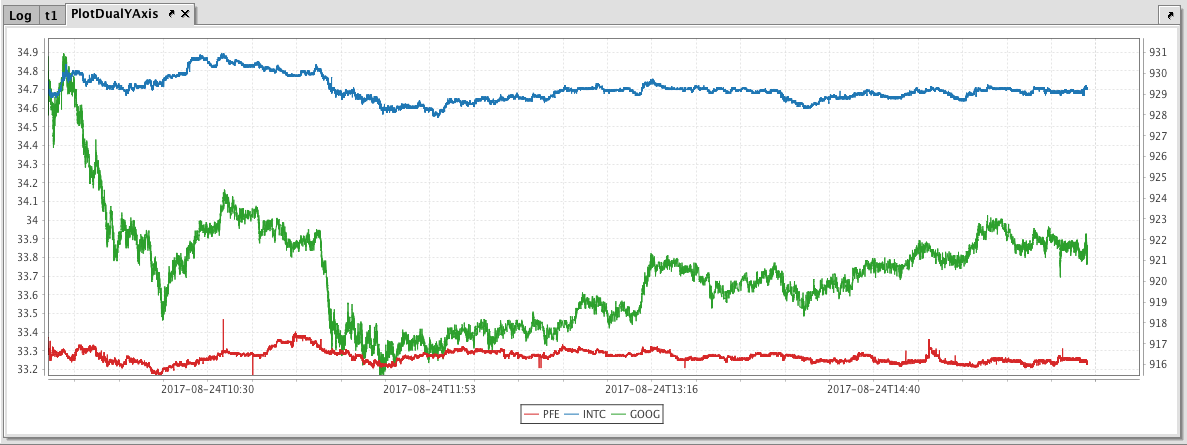
This issue can be easily remedied by adding a second Y axis to the chart via the twinX method. The twinX method enables you to use one Y axis for some of the series being plotted and a second Y axis for the others, while sharing the same X axis.
PlotName = figure()
.plot(...) //plot(s) placed before twinX() use the left Y axis
.twinX()
.plot(...) //plot(s) placed after twinX() use the right Y axis
The plots for the series placed before the twinX method share a common Y axis (on the left), while the plot(s) for the series listed after the twinX method share a common Y axis on the right. All plots share the same X axis.
Example
t1 = db.t("LearnIris","StockTrades").where("Date=`2017-08-24`","USym in `PFE`,`INTC`,`GOOG`")
PlotDualYAxis = plot("PFE", t1.where("USym = `PFE`"), "Timestamp", "Last")
.plot("INTC", t1.where("USym = `INTC`"), "Timestamp", "Last")
.twinX()
.plot("GOOG", t1.where("USym = `GOOG`"), "Timestamp", "Last")
.xBusinessTime()
.show()
When the code shown above is processed, values for PFE and INTC are shown on the left Y axis, while the values for GOOG are shown on the right.
XY Series - Scatter Plot
Scatter plots use the same plot method as other XY series charts. However, only the data points are displayed. To create the scatter plot, we just turn off the line visibility and turn on the point visibility, as shown in the following query:
// Note: The following assumes you have already loaded a dataset in a table named hwTable. This table is not included with Deephaven.
ScatterPlot=plot("Height/Weight", hwTable, "W","H")
.linesVisible(false) // turns the line visibility off
.pointsVisible(true) // turns the point visibility on
.show()
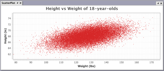
When the query shown above is processed in Deephaven, the following chart is generated:
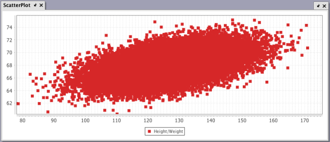
While this chart does show the correlation between height and weight, it looks more like a blob than a scatter. This is because there are more than 5,000 points being plotted. However, this chart can be enhanced with a few more adjustments as highlighted below.
ScatterPlot=plot("Height/Weight", hwTable, "W","H")
.linesVisible(false) // turns the line visibility off
.pointsVisible(true) // turns the point visibility on
.pointSize(0.1) //reduces point size to 1/10th of default
.chartTitle("Height vs Weight of 18-year-olds") //adds a chart title
.xLabel("Weight (lbs)") //adds label to X axis
.yLabel("Height (in)") //adds label to y axis
.legendVisible(false) // turns legend visibility off
.show()
Alternatively, you could also use the plotStyle method to reduce some of the coding needed for this query as highlighted below:
ScatterPlot=plot("Height/Weight", hwTable,"W","H")
.pointSize(0.1) //reduces point size to 1/10th of default.
.plotStyle("Scatter")
.chartTitle("Height vs Weight of 18-year-olds") //adds a chart title
.xLabel("Weight (lbs)") //adds label to X axis
.yLabel("Height (in)") //adds label to y axis
.legendVisible(false) // turns legend visibility off
.show()
Category (catPlot)
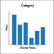
Category charts display the values of data from different discrete categories. By default, values are presented as vertical bars. However, the chart can be presented as a bar, a stacked bar, a line, an area or a stacked area.
Syntax
When data is sourced from a table, the following syntax can be used:
catPlot("SeriesName", source, "CategoryCol", "ValueCol")
catPlotis the method used to create a category chart."SeriesName"is the name (string) you want to use to identify the series on the chart itself.sourceis the table that holds the data you want to plot."CategoryCol"is the name of the column (as a string) to be used for the categories."ValueCol"is the name of the column (as a string) to be used for the values.
When data is sourced from arrays, the following syntax can be used:
catPlot("SeriesName", [category], [values])
catPlotis the method used to create a category chart."SeriesName"is the name (as a string) you want to use to identify the series on the chart itself.[category]is the array containing the data to be used for the X values.[values]is the array containing the data to be used for the Y values.
Example
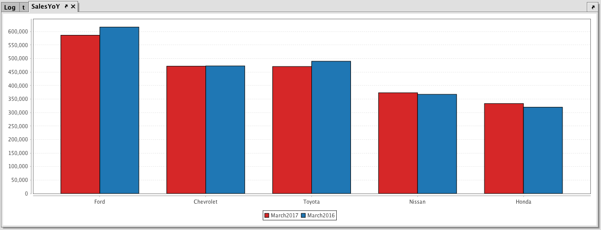
//Note: The following query assumes the dataset has already been saved to a table named sales. This dataset is not included with Deephaven.
SalesYoY = catPlot("March2016", sales, "Brand", "SoldMarch2016")
.catPlot("March2017", sales, "Brand", "SoldMarch2017")
.show()
When the code above is processed, the following category chart is produced, which compares March sales for the top five automotive brands in both 2016 and 2017.
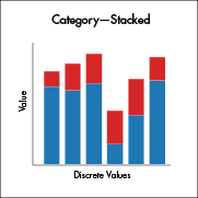
Example - Stacked Category Chart
In addition to showing each series for each category as its own bar, Deephaven also allows you to create a stacked bar chart, where each series is stacked on top of the other. This is accomplished by applying the plot style method. Here's the query:
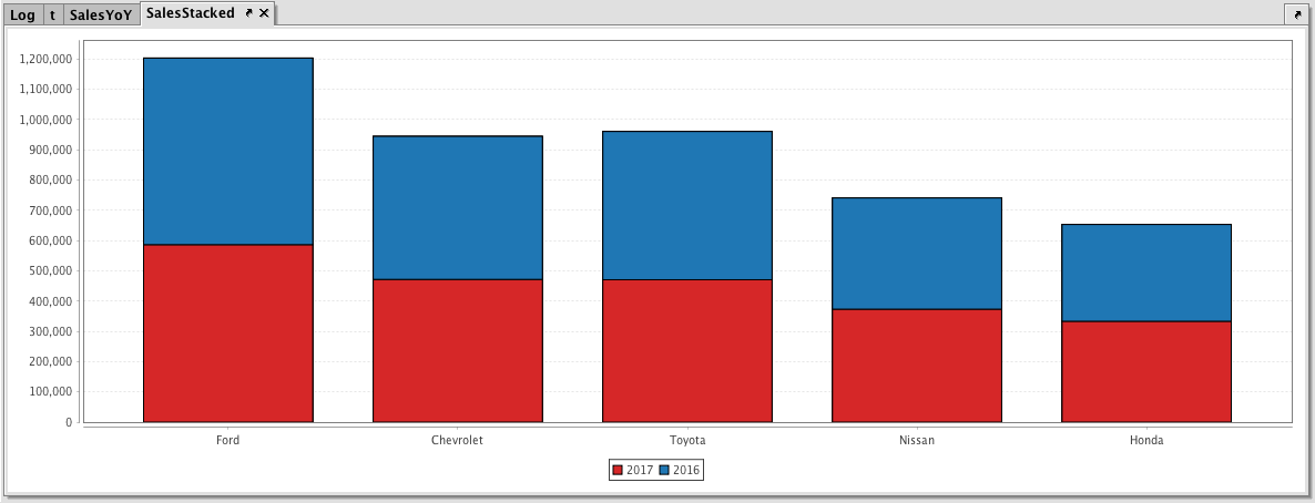
//The following query assumes the dataset has already been saved to a table named sales.
SalesStacked = catPlot("2017", sales, "Brand", "SoldMarch2017")
.catPlot("2016", sales, "Brand", "SoldMarch2016")
.plotStyle("Stacked_Bar")
.show()
In the first part of the query, the catPlot method is used to create a plot using the series named 2017 from the table named Sales, using Brand as the category column and SoldMarch2017 as the value column. The second series is then plotted using the same catPlot method with its respective series and column names. We then use plotStyle("Stacked_Bar") to stack the two series. Finally, the show method completes the query.
After the query runs in Deephaven, the following chart is created.
Example 3 - Multiple Sets of Stacked Category Plots
Multiple sets of stacked category plots can be created by assigning each series to a group and then applying a plot style. The following shows a query that would create two sets of stacked bars per category:
//The following query assumes the dataset has already been saved to a table named sales2.
multiStackCatPlot=catPlot("2017", sales2, "Brand", "SoldMarch2017")
.group(1)
.catPlot("2016", sales2, "Brand", "SoldMarch2016")
.group(1)
//the two series above are assigned to group 1
.catPlot("2015", sales2, "Brand", "SoldMarch2015")
.group(2)
.catPlot("2014", sales2, "Brand", "SoldMarch2014")
.group(2)
//the two series above are assigned to group 2
.plotStyle("Stacked_Bar")
.show()
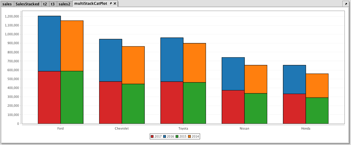
When we run this query in Deephaven, the data for 2017 and 2016 (red and blue) are now in one stacked group and the data for 2015 and 2014 (green and orange) are stacked in another group
Histogram (histPlot)
The Histogram is used to show how frequently different data values occur. The data is divided into logical intervals (or bins) , which are then aggregated and charted with vertical bars. Unlike bar charts (category charts), bars in histograms do not have spaces between them unless there is a gap in the data.
Syntax
When data is sourced from a table, the following syntax can be used:
histPlot("seriesName", source, "ValueCol", nbins)
histPlotis the method used to create a histogram."SeriesName"is the name (as a string) you want to use to identify the series on the chart itself.sourceis the table that holds the data you want to plot."ValueCol"is the name of the column (as a string) of data to be used for the X values.nbinsis the number of intervals to use in the chart.
When data is sourced from an array, the following syntax can be used:
histPlot("SeriesName", [x], nbins)
histPlotis the method used to create a histogram."SeriesName"is the name (as a string) you want to use to identify the series on the chart itself.[x]is the array containing the data to be used for the X values.nbinsis the number of intervals to use in the chart.
The histPlot method assumes you want to plot the entire range of values in the dataset. However, you can also set the minimum and maximum values of the range using rangeMin and rangeMax respectively.
The following example shows the syntax using a table as the datasource:
histPlot("seriesName", source, "ValueCol", rangeMin, rangeMax, nbins)
histPlotis the method used to create a histogram."SeriesName"is the name (as a string) you want to use to identify the series on the chart itself.sourceis the table that holds the data you want to plot."ValueCol"is the name of the column (as a string) of data to be used for the X values.rangeMinis the minimum value (as a double) of the range to be included.rangeMaxis the maximum value (as a double) of the range to be included.nbinsis the number of intervals to use in the chart.
The following example shows the syntax using an array as the datasource:
histPlot("SeriesName", [x], rangeMin, rangeMax, nbins)
histPlotis the method used to create a histogram."SeriesName"is the name (as a string) you want to use to identify the series on the chart itself.[x]is the array containing the data to be used for the X values.rangeMinis the minimum value (as a double) of the range to be included.rangeMaxis the maximum value (as a double) of the range to be included.nbinsis the number of the intervals to use in the chart.
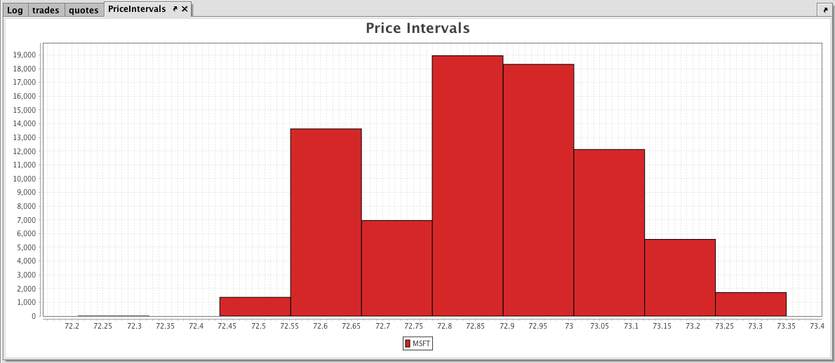
Example
trades = db.t("LearnIris", "StockTrades")
.where("Date=`2017-08-25`")
.view("Sym", "Last", "Size", "ExchangeTimestamp")
PriceIntervals = histPlot("MSFT", trades.where("Sym=`MSFT`"), "Last", 10)
.chartTitle("Price Intervals")
.show()
The first part of the query, retrieves the data from the StockTrades table in the LearnIris namespace.
The second part of the query, plots the histogram as follows:
PriceIntervalsis the name of the variable that will hold the chart.histPlotis the method.MSFTis the name of the series to use in the chart.trades.where("Sym=`MSFT`")is the table from which our data is being pulled, filtered to show data only when the value in theSymcolumn isMSFT.Lastis the name of the column in the table that contains the values we want to plot, and10is the number of intervals we want to use to divide up the sales.- And, finally, the
showmethod presents the chart in thePriceIntervalsvariable.
When Deephaven processes the query, the histogram is produced. There are 10 bars on the histogram, showing the Price Intervals into 10 value groups.
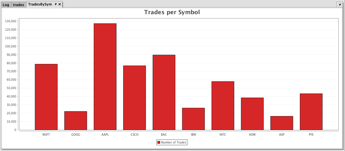
Category Histogram (catHistPlot)
The Category Histogram is used to show how frequently a set of discrete values (categories) occur.
Category histograms can be plotted using data from tables or arrays.
Syntax
When data is sourced from a table, the following syntax can be used:
catHistPlot("seriesName", source, "ValueCol")
catHistPlotis the method used to create a Category Histogram."SeriesName"is the name (as a string) you want to use to identify the series on the chart itself.sourceis the table that holds the data you want to plot."ValueCol"is the name of the column (as a string) containing the discrete values.
When data is sourced from an array, the following syntax can be used:
catHistPlot("SeriesName", [Values])
catHistPlotis the method used to create a Category Histogram."SeriesName"is the name (as a string) you want to use to identify the series on the chart itself.[Values]is the array containing the discrete values.
Example
trades = db.t("LearnIris", "StockTrades")
.where("Date=`2017-08-25`")
.view("Sym", "Last", "Size", "ExchangeTimestamp")
TradesBySym = catHistPlot("Number of Trades", trades, "Sym")
.chartTitle("Trades per Symbol")
.show()
The first part of the query, retrieves the data from the StockTrades table in the LearnIris namespace.
The second part of the query, plots the histogram as follows:
TradesBySymis the name of the variable that will hold the chart.catHistPlotis the method.Number of Tradesis the name of the series to use in the chart.tradesis the table from which our data is being pulled.Symis the name of the column in the table containing the discrete values..chartTitle("Trades per Symbol")adds a chart title to the plot- And, finally, the
showmethod presents the chart in theTradesBySymvariable.
When the code above is processed, the following category histogram is produced, which represents the number of trades for each symbol in the table.
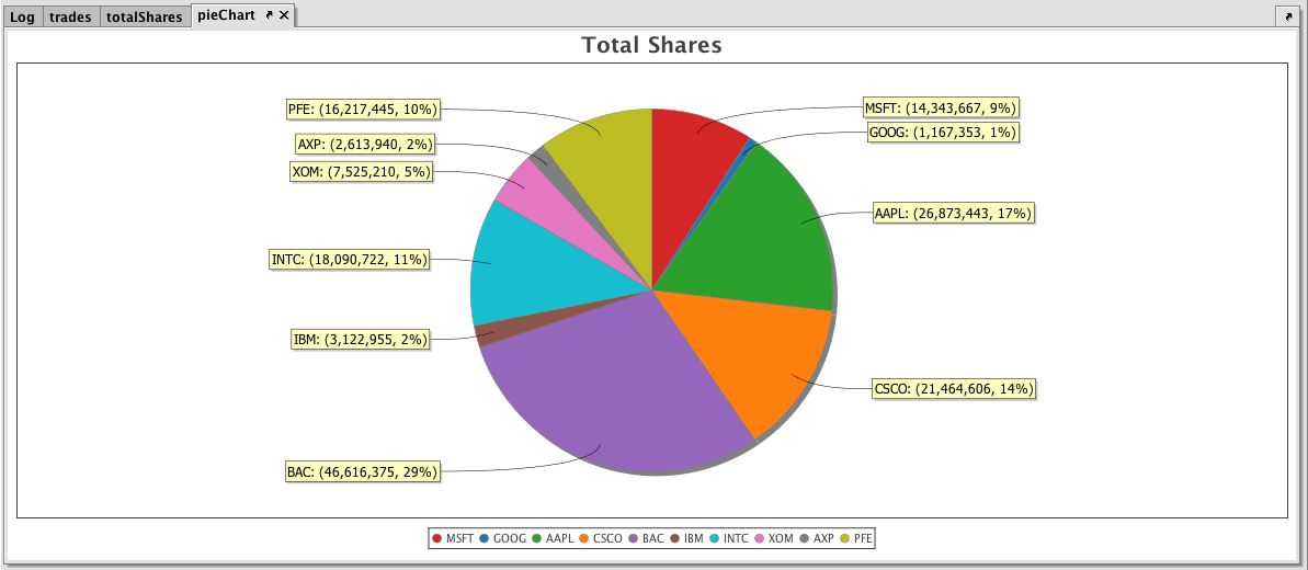
Pie (piePlot)
The pie chart shows data as sections of a circle to represent the relative proportion for each category. These sections can resemble slices of a pie.
Syntax
When data is sourced from a table, the following syntax can be used:
piePlot("SeriesName", source, "CategoryCol", "ValueCol")
piePlotis the method used to create a pie chart."SeriesName"is the name (as a string) you want to use to identify the series on the chart itself.sourceis the table that holds the data you want to plot"CategoryCol"is the name of the column (as a string) to be used for the categories"ValueCol"is the name of the column (as a string) to be used for the values
When data is sourced from an array, the following syntax can be used:
piePlot("SeriesName", [category], [values]")
piePlotis the method used to create a pie chart."SeriesName"is the name (as a string) you want to use to identify the series on the chart.[category]is the array containing the data to be used for the X values[values]is the array containing the data to be used for the Y values
Example
trades = db.t("LearnIris", "StockTrades")
.where("Date=`2017-08-25`")
.view("Sym", "Last", "Size", "ExchangeTimestamp")
totalShares = trades.view("Sym", "SharesTraded=Size").sumBy("Sym")
pieChart = piePlot("Shares Traded", totalShares, "Sym", "SharesTraded")
.chartTitle("Total Shares")
.show()
When the code above is processed, the following pie chart is produced, which shows the number of shares traded on August 25, 2017 for each symbol in the table.
Open, High, Low and Close (ohlcPlot)
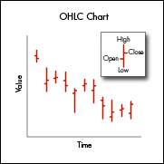
The Open, High, Low and Close (OHLC) chart typically shows four prices of a security or commodity per time slice: the open and close of the time slice, and the highest and lowest values reached during the time slice.
This charting method requires a dataset that includes one column containing the values for the X axis (time), and one column for each of the corresponding four values (open, high, low, close).
Syntax
When data is sourced from a table, the following syntax can be used:
ohlcPlot("SeriesName", source, "Time", "Open", "High", "Low", "Close")
ohlcPlotis the method used to create an Open, High, Low and Close chart."SeriesName"is the name (as a string) you want to use to identify the series on the chart itself.sourceis the table that holds the data you want to plot."Time"is the name (as a string) of the column to be used for the X axis."Open"is the name of the column (as a string) holding the opening price."High"is the name of the column (as a string) holding the highest price."Low"is the name of the column (as a string) holding the lowest price."Close"is the name of the column (as a string) holding the closing price.
When data is sourced from an array, the following syntax can be used:
ohlcPlot("SeriesName",[Time], [Open], [High], [Low], [Close])
ohlcPlotis the method used to create an Open, High, Low and Close chart."SeriesName"is the name (as a string) you want to use to identify the series on the chart itself.[Time]is the array containing the data to be used for the X axis.[Open]is the array containing the data to be used for the opening price.[High]is the array containing the data to be used for the highest price.[Low]is the array containing the data to be used for the lowest price.[Close]is the array containing the data to be used for the closing price.
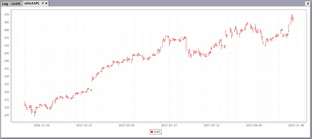
Example
tAAPL = db.t("LearnIris","EODTrades").where("Ticker=`AAPL`")
ohlcAAPL = ohlcPlot("AAPL", tAAPL, "EODTimestamp", "Open", "High", "Low", "Close").show()
The first line of the query creates the tAAPL table using data from the LearnIris namespace and the EODTrades table.
The next line contains the information needed for the plot:
ohlcAAPLis the name of the variable that will hold the chart.ohlcPlotis the method.AAPLis the name of the series to be used in the chart.tAAPLis the table from which our data is being pulled.EODTimestampis the name of the column to be used for the X axis.Open, High, Low, andClose, are the names of the columns containing the four respective data points to be plotted on the Y axis.- And, finally, the
showmethod presents the chart in theohlcAAPLvariable.
When the code above is processed, the following OHLC chart is produced, which represents the opening, high, low and closing price of AAPL over a year:
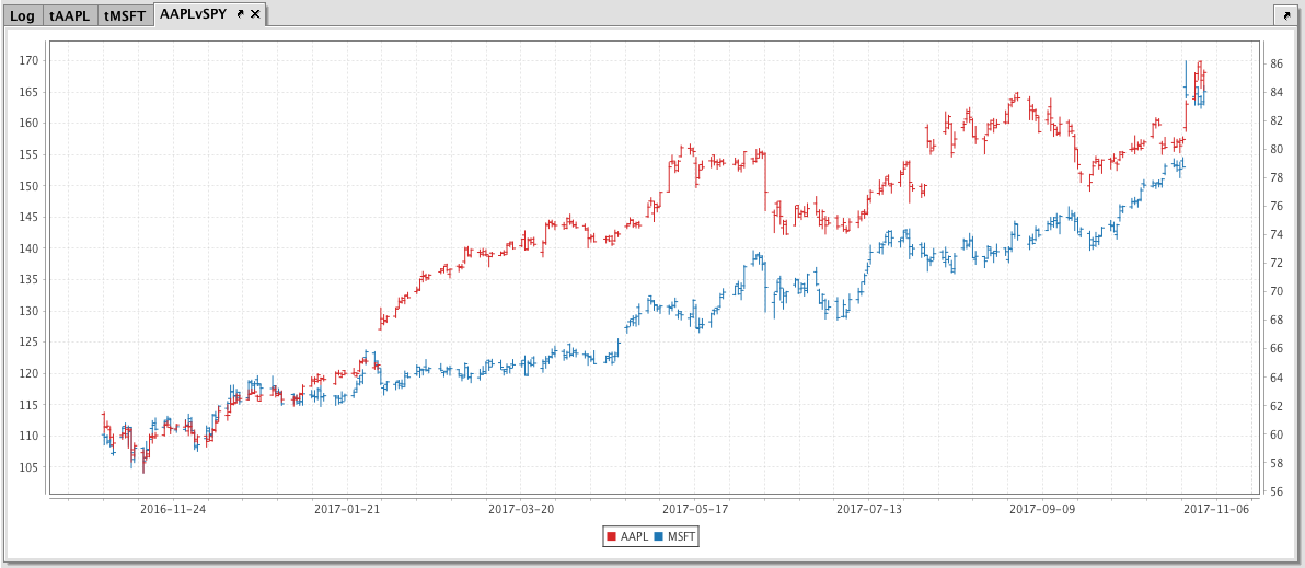
Just like the XY series chart, the Open, High, Low and Close chart can also be used to present multiple series on the same chart, including the use of multiple Y axes. An example of this follows:
tAAPL = db.t("LearnIris","EODTrades").where("Ticker=`AAPL`")
tMSFT = db.t("LearnIris","EODTrades").where("Ticker=`MSFT`")
AAPLvSPY = ohlcPlot("AAPL", tAAPL,"EODTimestamp","Open","High","Low","Close")
.twinX()
.ohlcPlot("MSFT", tMSFT,"EODTimestamp","Open","High","Low","Close")
.show()
When the code above is processed, the following OHLC chart is produced, which represents the opening, high, low and closing price of AAPL and MSFT over a year:
Error Bar Charts
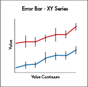
Error Bar charting is available for XY Series Charts and Category Charts. Error Bar charts, which visually indicate the uncertainties in a dataset, are useful in determining whether the variability in your data is statistically significant. For instance, if your chart shows average values, a short error bar shows that the average value is more certain because the values are concentrated, while a long error bar shows a greater amount of uncertainty because the values are spread out, and thus less reliable. The Error Bars typically represent standard deviation or a particular confidence interval.
XY Series Charts with Error Bars
There are three methods available to plot an XY Series Chart with Error Bars:
errorBarX()is used to create an XY Series Chart with error bars drawn in the same direction as the X axis (horizontally).errorBarY()is used to create an XY Series Chart with error bars drawn in the same direction as the Y axis (vertically).errorBarXY()is used to create an XY Series Chart with error bars drawn both horizontal and vertically.
errorBarX
When data is sourced from a table, the following syntax can be used:
errorBarX("SeriesName", source, "x", "y", "xLow", "xHigh")
errorBarXis the method used to create an errorBarX chart.- "
SeriesName" is the name (as a string) you want to use to identify the series on the chart itself. sourceis the table that holds the data to be used for the plot- "
x" is the name of the column of data to be used for the X value - "
y" is the name of the column of data to be used for the Y value - "
xLow" is the name of the column of data to be used for the low error value on the X axis - "
xHigh" is the name of the column of data to be used for the high error value on the X axis
When data is sourced from arrays, the following syntax can be used:
errorBarX("SeriesName", [x], [y], [xLow], [xHigh])
errorBarXis the method used to create an errorBarX chart.- "
SeriesName" is the name (as a string) you want to use to identify the series on the chart itself. - "
[x]" is the array containing the data to be used for the X value - "
[y]" is the array containing the data to be used for the Y value - "
[xLow]" is the array containing the data to be used for the low error value on the X axis - "
[xHigh]" is the array containing the data to be used for the high error value on the X axis
errorBarY
When data is sourced from a table, the following syntax can be used:
errorBarY("SeriesName", source, "x", "y", "yLow", "yHigh")
errorBarYis the method used to create an errorBarY chart.- "
SeriesName" is the name (as a string) you want to use to identify the series on the chart itself. sourceis the table that holds the data to be used for the plot- "
x" is the name of the column of data to be used for the X value - "
y" is the name of the column of data to be used for the Y value - "
yLow" is the name of the column of data to be used for the low error value on the Y axis - "
yHigh" is the name of the column of data to be used for the high error value on the Y axis
When data is sourced from arrays, the following syntax can be used:
errorBarY("SeriesName", [x], [y], [yLow], [yHigh])
errorBarYis the method used to create an errorBarY chart.- "
SeriesName" is the name (as a string) you want to use to identify the series on the chart itself. - "
[x]" is the array containing the data to be used for the X value - "
[y]" is the array containing the data to be used for the Y value - "
[yLow]" is the array containing the data to be used for the low error value on the Y axis - "
[yHigh]" is the array containing the data to be used for the high error value on the Y axis
errorBarXY
When data is sourced from a table, the following syntax can be used:
errorBarXY("SeriesName", source, "x", "xLow", "xHigh", "y", "yLow", "yHigh")
errorBarXYis the method used to create an errorBarXY chart.- "
SeriesName" is the name (as a string) you want to use to identify the series on the chart itself. sourceis the table that holds the data to be used for the plot- "
x" is the name of the column of data to be used for the X value - "
xLow" is the name of the column of data to be used for the low error value on the X axis - "
xHigh" is the name of the column of data to be used for the high error value on the X axis - "
y" is the name of the column of data to be used for the Y value - "
yLow" is the name of the column of data to be used for the low error value on the Y axis - "
yHigh" is the name of the column of data to be used for the high error value on the Y axis
When data is sourced from arrays, the following syntax can be used:
errorBarXY("SeriesName", "[x]", [xLow], [xHigh], "[y]", [yLow], [yHigh])
errorBarXis the method used to create an errorBarX chart..- "
SeriesName" is the name (as a string) you want to use to identify the series on the chart itself. - "
[x]" is the array containing the data to be used for the X value - "
[xLow]" is the array containing the data to be used for low error value on the X axis - "
[xHigh]" is the array containing the data to be used for high error value on the X axis - "
[y]" is the array containing the data to be used for the Y value - "
[yLow]" is the array containing the data to be used for low error value on the Y axis - "
[yHigh]" is the array containing the data to be used for high error value on the Y axis
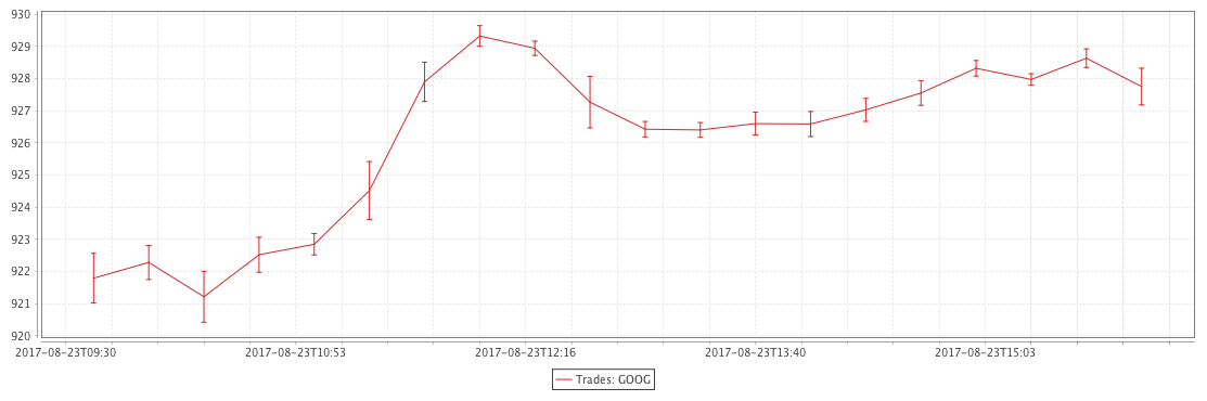
Example - errorBarY
The query shown in the example below will plot the standard deviation in the value of Google trades every 20 minutes. The resulting chart will be plotted as a line graph with error bars running vertically.
//source the data
trades = db.t("LearnIris", "StockTrades")
.where("Date = `2017-08-23`", "USym = `GOOG`")
.updateView("TimeBin=upperBin(Timestamp, 20 * MINUTE)")
.where("isBusinessTime(TimeBin)")
//calculate standard deviations for the upper and lower error values
tradesStats = trades.by(AggCombo(AggAvg("AvgPrice = Last"), AggStd("StdPrice = Last")), "TimeBin")
//plot the data
tradesXYPlot = errorBarY("Trades: GOOG", tradesStats.update("AvgPriceLow = AvgPrice - StdPrice", "AvgPriceHigh = AvgPrice + StdPrice"), "TimeBin", "AvgPrice", "AvgPriceLow", "AvgPriceHigh").show()
The first code block gathers the data for the chart, telling Deephaven to access the StockTrades table in the LearnIris namespace, and then filter it to include only the data for August 23, 2017, and only when the USym is GOOG. The data is downsampled (binned) for 20 minute intervals, and is then filtered again to include only the data that occurs within business hours. That data is then saved to a new variable named trades.
The second block of code calculates the average of the values in the Last column and the standard deviation of the values in the Last column. The results will appear in new columns, AvgPrice and StdPrice respectively, in the new table called tradesStats.
The third code block tells Deephaven to:
- Create an errorBarY chart named
tradesPlot. - "
Trades: GOOG" is the series name - The data needed for plotting is sourced from the
tradesStatstable. Two columns in that table are created in the table using the update method:AvgPriceLowis calculated by subtracting the standard deviation of the price from the averageAvgPriceHighis calculated by adding the average price to the standard deviation.
- Data from the
TimeBincolumn is to be used for the X value - Data from the
AvgPricecolumn is to be used as the Y value - Data from the
AvgPriceLowcolumn is to be used for the low error value on the Y axis - Data from the
AvgPriceHighcolumn is to be used for the high error value on the Y axis - The
.showmethod then tells Deephaven to present the chart in the Deephaven console.
The resulting chart is presented below.
Category Charts with Error Bars
catErrorBar() is the method used to create a Category Chart with Error Bars. This creates a Category Chart with the discrete values on the X axis, numerical values on the Y axis. Error bars can only run vertically when using catErrorBar().
When data is sourced from a table, the following syntax can be used:
catErrorBar("SeriesName", source, "x", "y", "yLow", "yHigh")
catErrorBarXthe method used to create a Category Chart with vertical errorBars.- "
SeriesName" is the name (as a string) you want to use to identify the series on the chart itself. sourceis the table that holds the data you want to plot- "
x" is the name of the column of data to be used for the X value - "
y" is the name of the column of data to be used for the Y value - "
yLow" is the name of the column of data to be used for the low error value - "
yHigh" is the name of the column of data to be used for the high error value
When data is sourced from an array, the following syntax can be used:
catErrorBar("SeriesName", [x], [y], [yLow], [yHigh])
catErrorBarXthe method used to create a category chart with vertical errorBars.- "
SeriesName" is the name (as a string) you want to use to identify the series on the chart itself. - "
[x]" is the name of the column of data to be used for the X value - "
[y]" is the name of the column of data to be used for the Y value - "
[yLow]" is the name of the column of data to be used for the low error value on the Y axis - "
[yHigh]is the name of the column of data to be used for the high error value on the Y axis
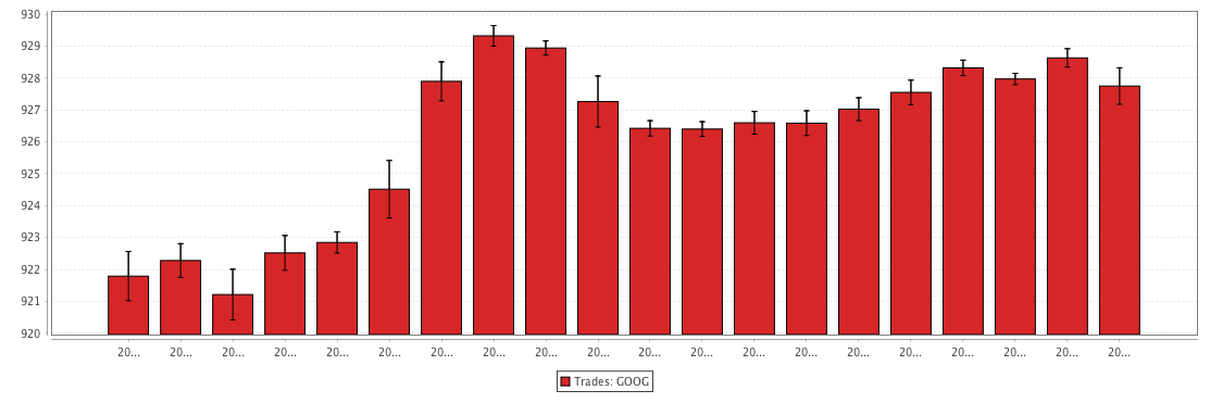
Example: catErrorBar
The query shown in the example below will plot the standard deviation in the value of Google trades every 20 minutes. The resulting chart will be plotted as a bar graph with error bars running vertically.
//source the data
trades = db.t("LearnIris", "StockTrades")
.where("Date = `2017-08-23`", "USym = `GOOG`")
.updateView("TimeBin=upperBin(Timestamp, 20 * MINUTE)")
.where("isBusinessTime(TimeBin)")
//calculate standard deviations for the upper and lower error values
tradesStats = trades.by(AggCombo(AggAvg("AvgPrice = Last"), AggStd("StdPrice = Last")), "TimeBin")
//plot the data
tradesCatPlot = catErrorBar("Trades: GOOG", tradesStats.update("AvgPriceLow = AvgPrice - StdPrice", "AvgPriceHigh = AvgPrice + StdPrice"), "TimeBin", "AvgPrice", "AvgPriceLow", "AvgPriceHigh").show()
The first code block gathers the data for the chart, telling Deephaven to access the StockTrades table in the LearnIris namespace, and then filter it to include only the data for August 23, 2017, and only when the USym is GOOG. The data is downsampled (binned) for 20 minute intervals, and is then filtered again to include only the data that occurs within business hours. That data is then saved to a new variable named trades.
The second block of code calculates the average of the values in the Last column and the standard deviation of the values in the Last column. The results will appear in new columns, AvgPrice and StdPrice respectively, in the new table called tradesStats.
The third code block tells Deephaven to:
- Create an
catErrorBarchart namedtradesCatPlot. - "
Trades: GOOG" is the series name - The data needed for plotting is sourced from the
tradesStatstable. Two columns in that table are created in the table using the update method:AvgPriceLowis calculated by subtracting the standard deviation of the price from the averageAvgPriceHighis calculated by adding the average price to the standard deviation.
- Data from the
TimeBincolumn is to be used for the X value - Data from the
AvgPricecolumn is to be used as the Y value - Data from the
AvgPriceLowcolumn is to be used for low error value on the Y axis - Data from the
AvgPriceHighcolumn is to be used for high error value on the Y axis - The
.showmethod then tells Deephaven to present the chart in the Deephaven console.
The resulting chart is presented below.
Last Updated: 23 September 2019 12:17 -04:00 UTC Deephaven v.1.20181212 (See other versions)
Deephaven Documentation Copyright 2016-2019 Deephaven Data Labs, LLC All Rights Reserved