Formatting Chart Components
As mentioned in Verbose Syntax section, any aspect of the figure can be manipulated by calling specific methods on the respective object (e.g., figure, chart, axes, axis). Each method used must be applied to the appropriate object, as defined in the Plotting API. For example, the figureTitle method cannot be called in the query before the figure is created. You can also refer to the Plotting Convenience Methods for "shortcuts" to some of the verbose syntax options.
The following are representative samples for customizing various components of figures and charts created in Deephaven. For the complete list of options, refer to the Javadocs.
Adding Titles and Labels
When figures and charts are created in Deephaven, titles and labels are not automatically added. However, they can easily be added with the following.
|
Sample Syntax |
Action |
|---|---|
figureTitle("Figure 5.1")
|
Add a figure title |
chartTitle("My Chart")
|
Add a chart title |
|
|
Add X axis label |
yLabel("Dollars")
|
Add Y axis label |
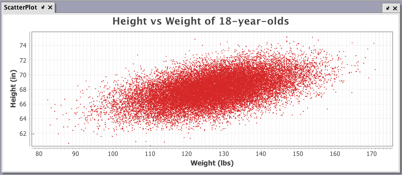
Example
The chartTitle, xLabel and yLabel methods are highlighted in the example query below.
ScatterPlot=figure()
.plot("Height/Weight", hwTable,"W","H")
.linesVisible(false)
.pointsVisible(true)
.pointSize(0.1)
.chartTitle("Height vs Weight of 18-year-olds") //adds a chart title
.xLabel("Weight (lbs)") //adds label to X axis
.yLabel("Height (in)") //adds label to y axis
.legendVisible(false)
.show()
When the code shown above is processed, the following chart is generated:
Setting Axis Ranges and Ticks
|
Sample Syntax |
Action |
|---|---|
xRange(0, 100)
|
Adjust the range of the X axis |
yMin(15.5)
|
Set the minimum value on the Y axis |
yMax(100)
|
Set the maximum value on the Y axis |
|
|
Add a shared axis |
xTickLabelAngle(45.0)
|
Change the angle of the tick labels on the X axis |
yTicks(10)
|
Set gap between major ticks on the Y axis |
|
|
Turn off minor ticks on both axes |
Setting the Time Format for an Axis
A time-related axis can be formatted using Java DataTimeFormatter strings. By default, Deephaven will attempt to determine an appropriate format. See the table below for some of the more common examples.
|
Sample Syntax |
Action |
Formatted Examples |
|---|---|---|
|
|
Change the format used on the X axis to show the year, month and day |
2017-03-08 |
|
|
Change the format used on the X axis to include only hours and minutes based on on a 24-hour clock |
14:45 |
|
|
Change the format used on the X axis to include only hours and minutes based on on a 12-hour clock with a.m./p.m notation |
02:45 p.m. |
|
|
Change the format used on the X axis to include hours, minutes and seconds |
14:45:59 |
|
|
Change the format used on the X axis to show the year, month, day, hour, minute and second |
2017-03-08T 14:45:59 |
Note: The plotting of time is accurate to approximately 250 nanoseconds. If greater precision is desired, please contact Deephaven Customer Support for guidance.
Setting the Decimal Format for an Axis
A numerical axis can be formatted using Java DecimalFormat strings. See the table below for some of the more common examples
|
Sample Syntax |
Action |
Formatted Examples |
|---|---|---|
|
|
Change the format of the Y axis and round to two mandatory decimal places. |
123,456.78 654.32 1.99 |
|
|
Change the decimal format of the Y axis to dollars and cents |
$123,456.78 $654.32 $1.99 |
|
|
Change the decimal format of the Y axis to dollars and cents, and then add further text to the value. |
$123,456 Million $654 Million $1 Million |
|
|
Change the Y axis to reflect percentage with two mandatory decimal places |
100.11% 10.22% 1.5% .98% |
|
|
Change the Y axis to reflect the value in scientific notation with two decimal places and one exponent. |
1.34E6 7.80E1 |
|
|
Change the Y axis to reflect the value in engineering notation with two decimal places and one exponent. |
321.34E8 1.34E6 .78E2 |
Plot Styles
Plot Styles are methods you can use to change the "style" of XY Series charts and Category charts. For example, an XY Series plot uses lines as a default to show the values being plotted. However, you can easily change that to a different style of chart by applying the plotStyle method. Arguments to the plotStyle method including the following:
- Bar
- Stacked_Bar
- Line
- Area
- Stacked_Area
- Scatter
- Step
Note: Argument capitalization does not matter
Examples using the plotStyle method follow:
|
Sample Syntax |
Action |
|---|---|
|
|
Change an XY series plot to present as an area plot instead of a line. |
|
|
Change an XY series plot to present as a step plot instead of a line. |
|
|
Change an category plot to present as a line plot instead of a column |
Plot Orientation
The plotOrientation method enables you to transpose the X and Y axes for the chart object. The default orientation of a chart is vertical – meaning the Y axis of the chart is displayed vertically. The syntax used to transpose the chart axes is shown below. The string used as the argument can be any subset of the beginning of the words "horizontal" or "vertical."
Syntax
plotOrientation(String)
or
plotOrientation(PlotOrientation)
Examples
plotOrientation("H")
plotOrientation("HoRiz")
plotOrientation("horizontal")
or
plotOrientation(PlotOrientation.VERTICAL)
Axis Transforms
Axis value ranges can be transformed to specific types with the following:
|
Sample Syntax |
Action |
|---|---|
xLog()
|
Convert the scale of the X axis to a logarithmic scale |
xBusinessTime()
|
Convert the scale of the X axis to a business calendar |
Last Updated: 23 September 2019 12:17 -04:00 UTC Deephaven v.1.20181212 (See other versions)
Deephaven Documentation Copyright 2016-2019 Deephaven Data Labs, LLC All Rights Reserved